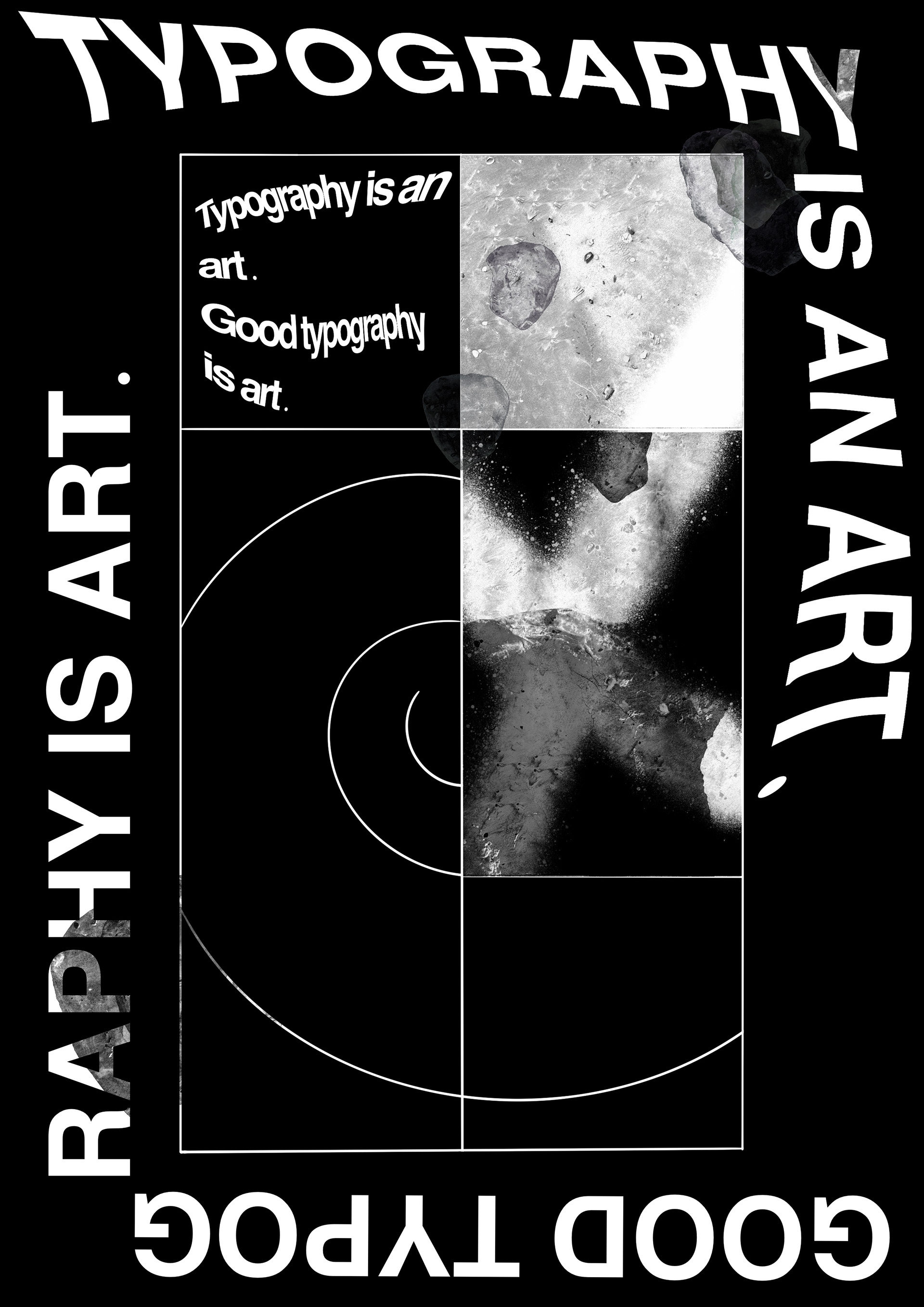
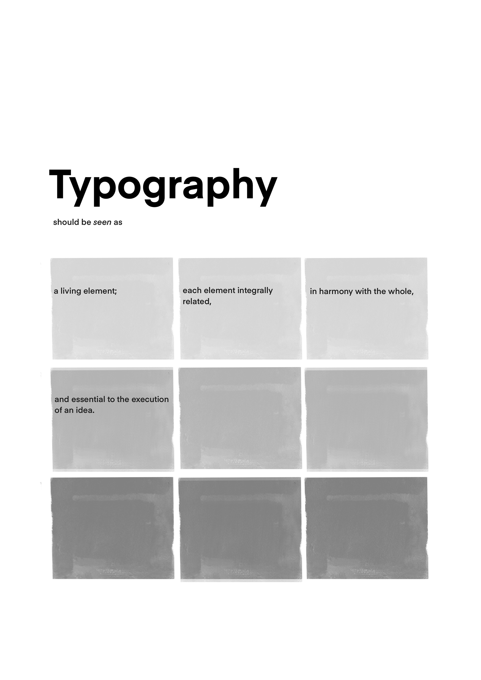
This project challenged me to work within set constraints—the text and black-and-white colour scheme were predefined. I designed two posters: one expressive and one formal. My visual summary shows 40–45 iterations per poster, reflecting my deep exploration of typography, colour balance, and layout within these limits.
I especially enjoyed experimenting with composition, treatments, and manipulation techniques, adding layers of meaning—particularly in the expressive poster. This process deepened my understanding of editorial design and the power of subtle design choices.