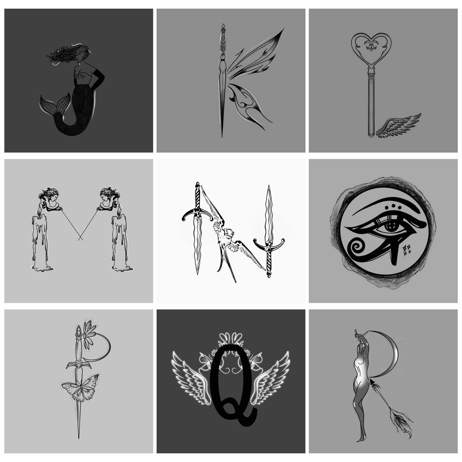
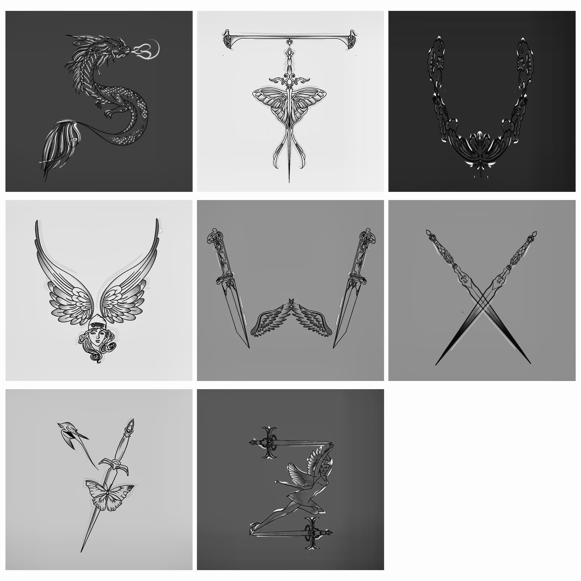
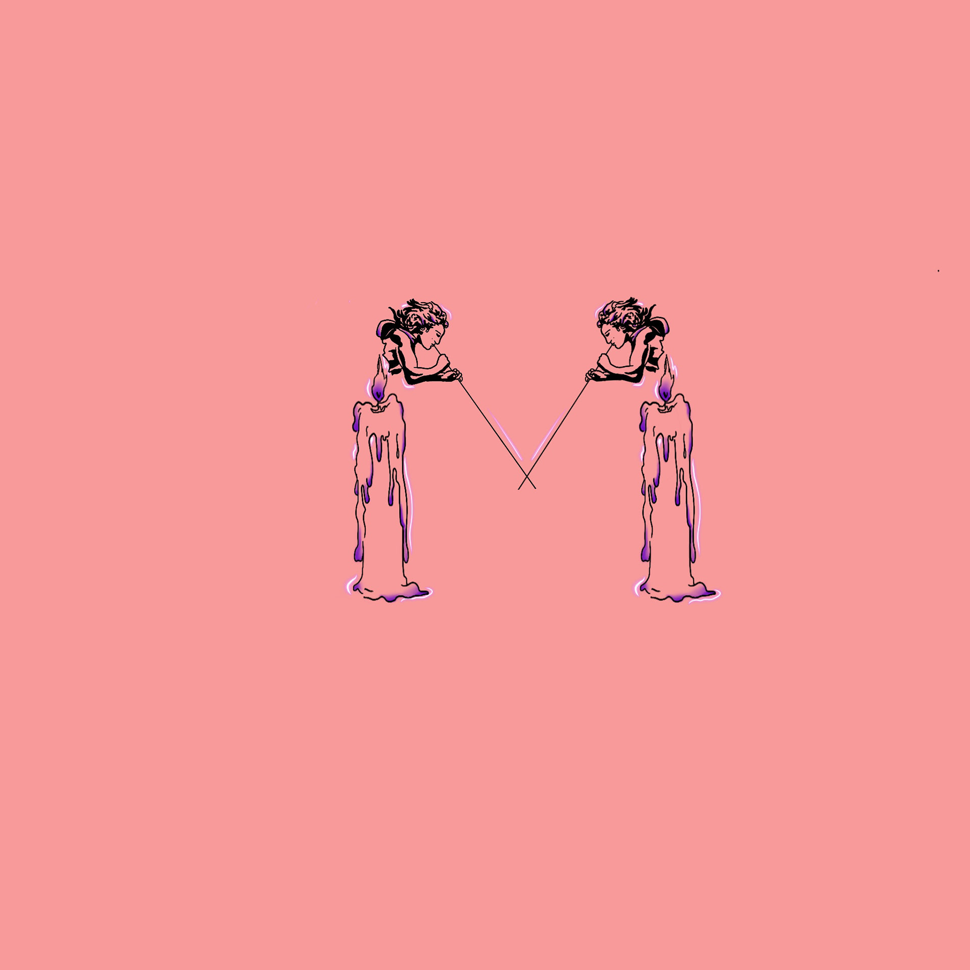
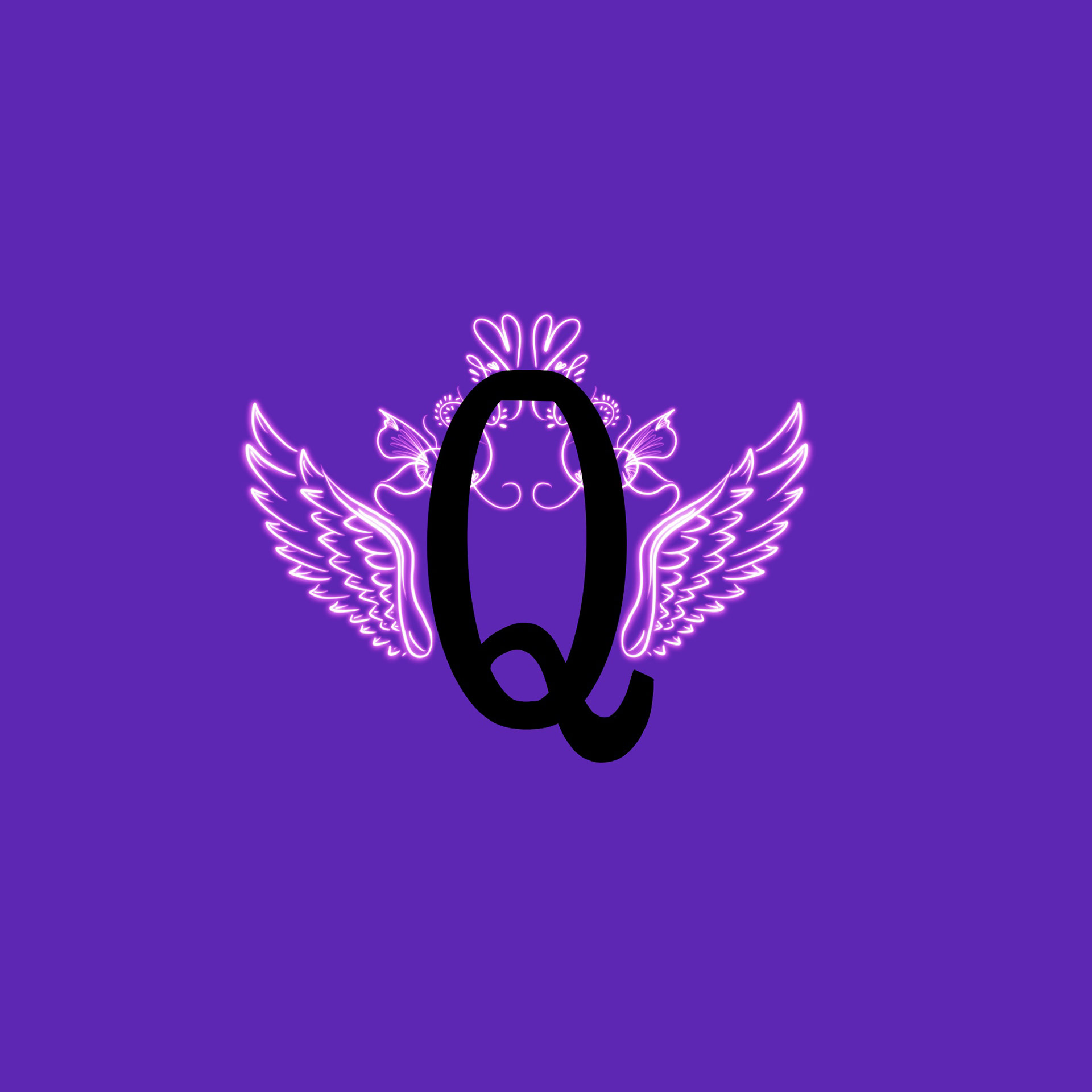
Ever since I’ve started my degree in graphic and media design, I’ve realised over the last few years I am very interested in typography, editorials, editorial design, photography, and poster design. That is the reason why I decided to explore 36 days of type and create my own type or font face. I saw a few examples of how people had created their type and I realise that there were no restrictions whatsoever and I could free flow with my imagination so that is one aspect that really caught my eye. I had an idea in mind since the start and I don’t think I budged on that even though I went through a series of iterations and changes throughout I stuck with my primary idea of how I wanted my type to be and  how I wanted it to look. My basic idea or inspiration for my day was from Roman structures, Greek structures, Roman and Greek paintings, angelic structures and symbols, fairy tales and fantasies, old Roman font, and old British font. I wanted to create a very classy yet a very detailed type of typeface or font, what I wanted to do was that every letter should have a certain amount of detail to it or a certain amount of imagery to it that it by itself looks like an artwork or a painting. I also wanted the entire typeface to come together as a whole so I did keep a certain narrative throughout, but I wanted each alphabet on its own to be considered as a separate piece of art. I tried inboard colour and monochrome and I felt like monochrome suited my entire idea better. The sense the idea of this was to go unconventional with font, make the font in a way that is never seen before and use different kinds of drawings and ideas to change or to create an unconventional type and I think that freedom is one reason why I really played around with my font and came to the final outcome I have now.
Back to Top