starting up, 15.12.2020
my basic foundation and groundwork for 'Demonstration'
demonstration post 1 - 02.01.2021
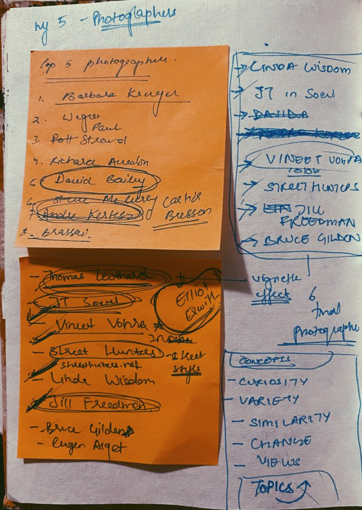
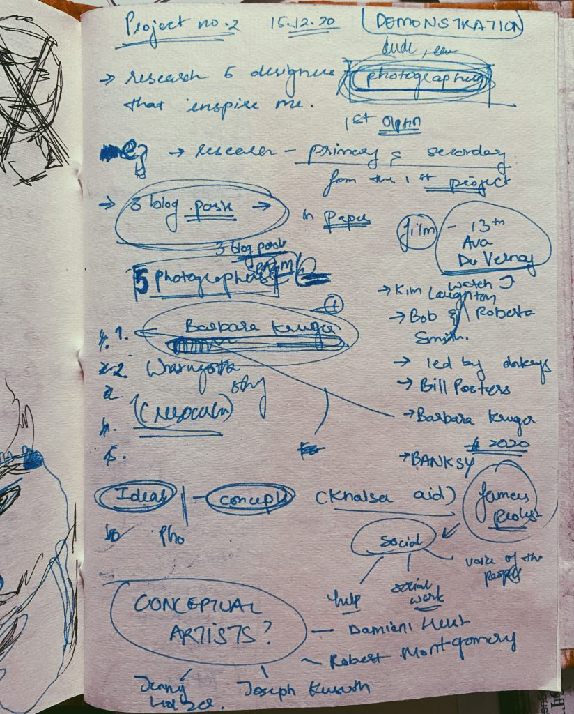
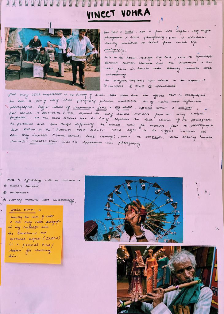
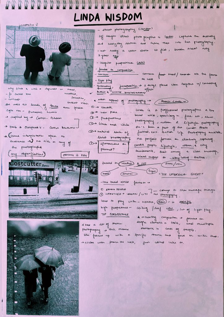
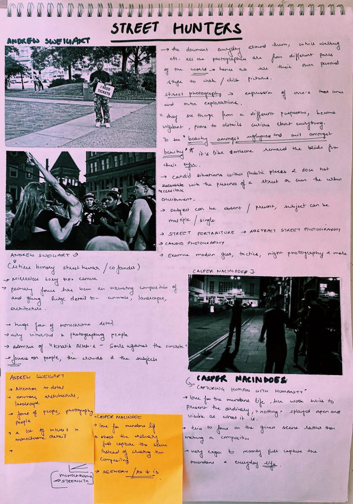
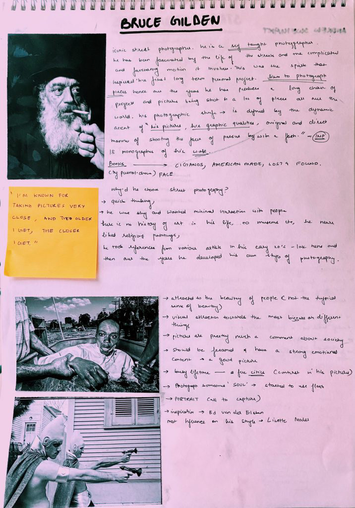
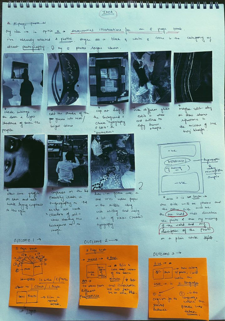
My primary research has been collected over the last few months and is all in the form of photography. It is a very wide range, consisting of different and unconventional photos I have focused on clicking pictures of specific things in my surroundings rather than complete sceneries and I’ve also clicked a lot of candid shots of people from very different perspectives in every shot. My secondary research is all done in paper and pen and I’ve researched on 4 street photographers and one graphic artist I will be taking inspiration from their work while following their style but experimenting on my own as well. I feel that by writing my research I've actually been able to apply it while taking pictures as I remembered the points and the style used by the photographers I've researched upon. I would like to research and experiment on paper rather than screen in the future as it is more beneficial for me.
demonstration post 2 – 13.01.2021
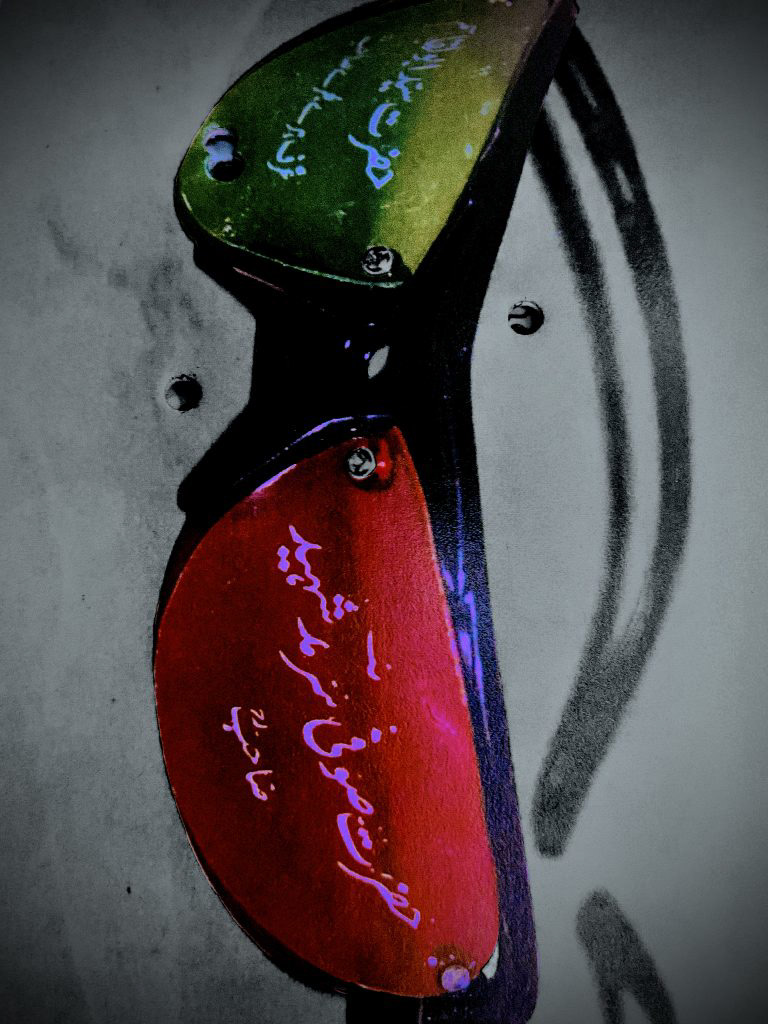
For my project, I have chosen the second topic, of sequential illustrations and text for an 8 page book. Through the pictures I have uploaded below, my trial and error methods on my photography can be seen. I have used manipulation of imagery and manipulation and repetition of typography. I plan on sticking to a minimalistic colour palette for each page in coordination with the image of that specific page. I will be using minimalistic typography styles and creating a lot of line drawings as well. While using the given fonts I will also be using my own handwriting to manipulate the typography on the image. My main focus is to keep a monochromatic colour scheme with the burst of one single colour in every page. I have decided to go with the traditional page layout, with the image on one side and the text on the other. The key moment in my research and idea was when I started editing my pictures and realised the pattern of typography and colour palate I wanted to keep which would also define my entire project. Another important realisation was when I decided that each graphic illustration/image of mine will have a one word description an idea, which will not be related do any other image in the eight page book in anyway .Thus, each illustration and each page will tell its own story.

S.W.O.T analysis for Demonstration; 25.01.21
STRENGTH- In this project, I was very clear from the beginning what option I would choose, thus I was able to form a well-planned and organized base for my idea. I was able to successfully collect excellent primary research and also use the knowledge I learned through my secondary research in my project work. I am able to connect and relate the primary research and the secondary research to my final outcome very successfully. Through that, this time my project looks complete and well related. I feel like I've not only reached but exceeded my personal level of achievement and expectations in this project.
WEAKNESS- As I was following a minimalistic palette throughout my pages I did struggle with ideas and creativity at times. My time management could have been better but was without a doubt better than the last project this time.
OPPORTUNITY- Through this project, I was actually able to try what I actually want to pursue in the future which is graphic designing and I was able to apply the knowledge skills I've learned through researching some of the world-famous graphic designers in my project. I feel like I have a much better understanding of graphic designing, and I've found a little of my style through the trial and errors of making my artwork for the project.
THREAT- My biggest threat over throughout the project was that both sides of my pages would not be in connectivity and they would not relate to each other, but after a lot of attempts and manipulation of imagery and typography I was able to achieve a strong connection within every page in each page tells its own story. Time management was a threat again, but I was much better I'm managing my time in this project than I was in the 'location' and I will improve with every project.
demonstration post 3 – 29.01.2021
By outcome for project “Demonstration” has not only reached but also exceeded my expectations. At first, I made a strong foundational base for the idea I had chosen. my primary research was already done and my secondary research was quite extensive this time. I was able to incorporate the knowledge and technical skills I had learned into my secondary research in my project and that is quite visible. I stuck with my idea of choosing a minimalistic color pallet – monochrome and a slash of red. Through my manipulation of imagery and typography, I’ve been able to design and edit my artwork successfully. I am yet to add 3 more pages I’ll be doing that this following week. I am done with 5 pages and they are uploaded below. My application of skill and knowledge through my secondary research was very successful and is mainly the reason for the outcome that I have achieved. I was able to follow my plan while also experiencing a lot through multiple trials and errors in my artwork. my time management could have been better, but it was an improvement from the last project. I feel at this time as I successfully established a solid foundation/base plan about my idea I was able to carry out all the work in a better way and I was less stressed. Through handwriting my secondary research I was actually able to use a lot of skills in the knowledge that the people I had researched upon had used in my artwork in my project, which increases the standard of my project highly. Through multiple trials of manipulation and editing of my imagery and typography, I was able to find a hint of my style for my designs. I would surely improve on my time management skills as I do more projects.
My “Demonstration” project explained; 29.01.2021
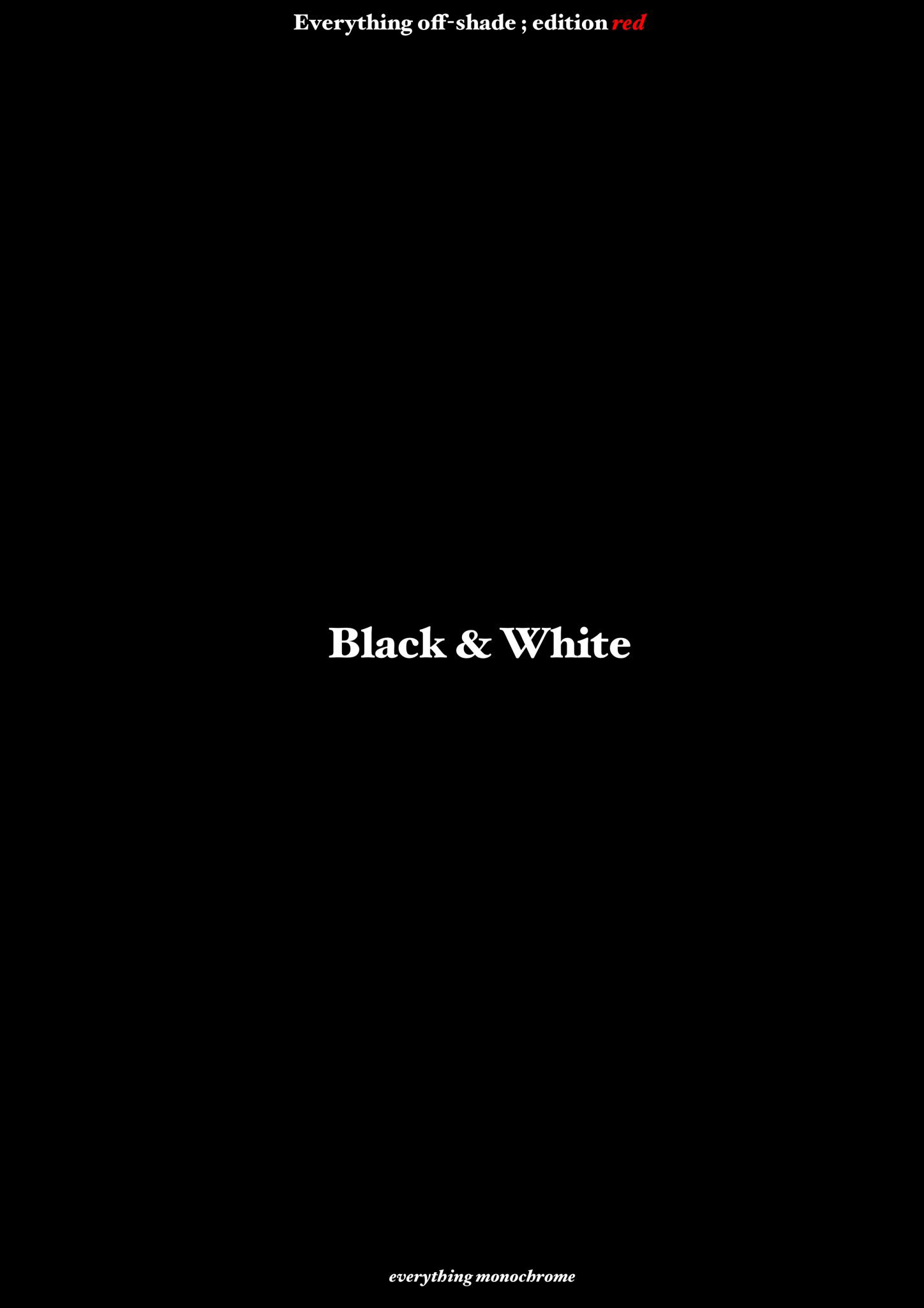
This is an explanation of my demonstration project. I’ve used the traditional page layout with the photos on the right side in the text on the left. my project is quite complex hence I’m writing this explanation so that the viewer gets a better understanding of my project. My project is built on the lines of a minimalistic color palette with a bright splash of just one color – red. Every 2 sides/2 pages running to each other have a great story and a great understanding between each other but are in no way linked to the other pages or sides in the magazine. Even though it is a magazine each page does a different story, has a different background, and is only connected on the basis of the monochromatic palette and the color scheme that is followed. I’ve tried to break through by manipulating typography in each and every page and combining traditional methods, typography, and layout with the modern-day editing, eye to design and manipulation of imagery and typography. the cover pages of my project are very minimalistic and very simple which gives a wrong perception of what might be inside, thus following through with my idea of “breaking through boundaries”. My project, on one hand, being very minimalistic, basic, and simple is also very versatile and very complex through its art and the ideas behind each artwork.
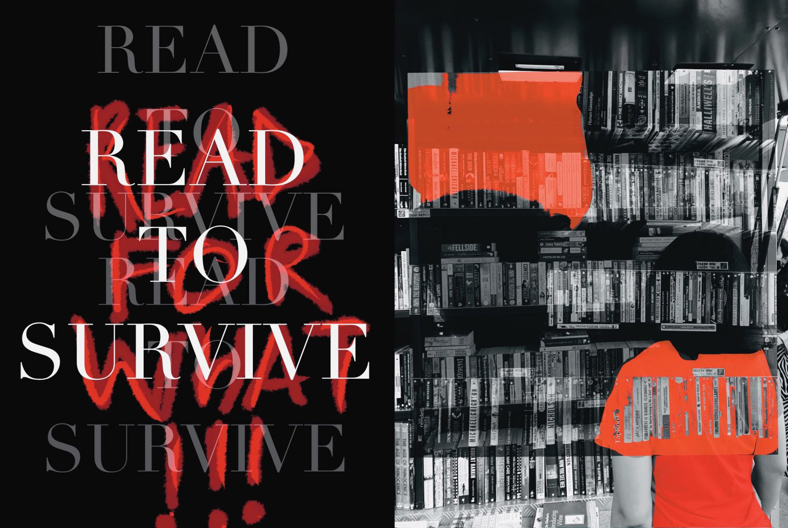
Survive – page 1 – the first artwork follows the monochromatic in the word colour scheme unanswered tells us the importance to read which is to survive in the freehand text it also comments ‘read for what ‘. the use of a traditional font along with handwritten text and the showcasing of books, one of the oldest known things to earth along with the modern-day editing is what shows the contrast.
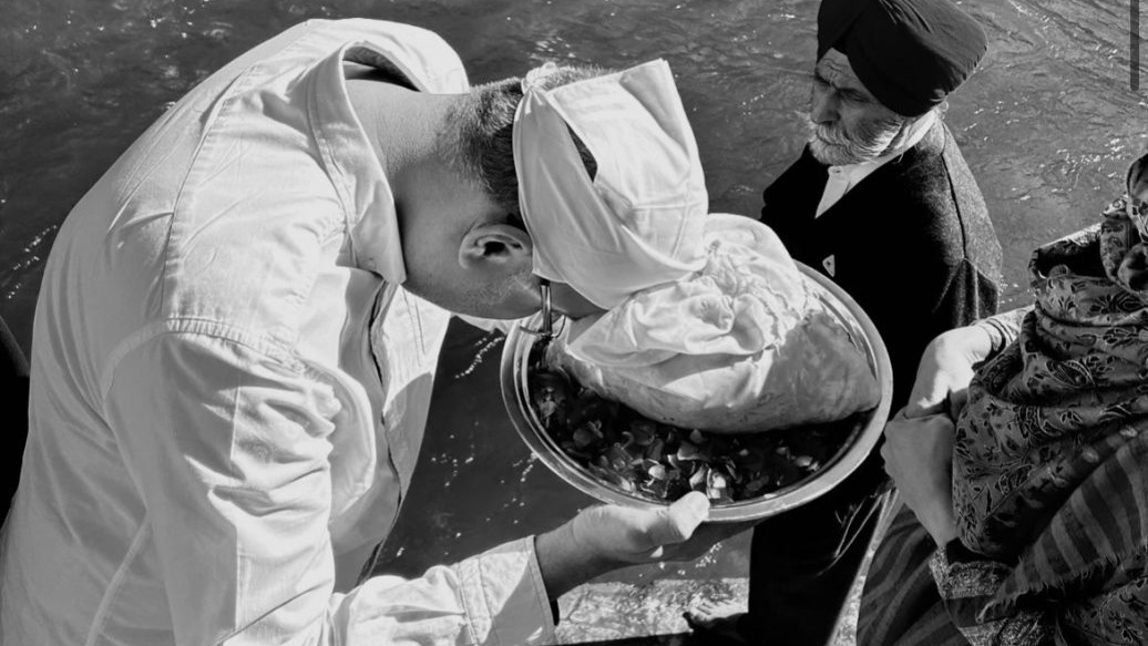
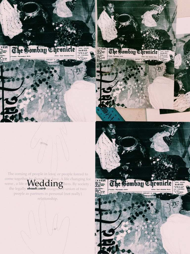
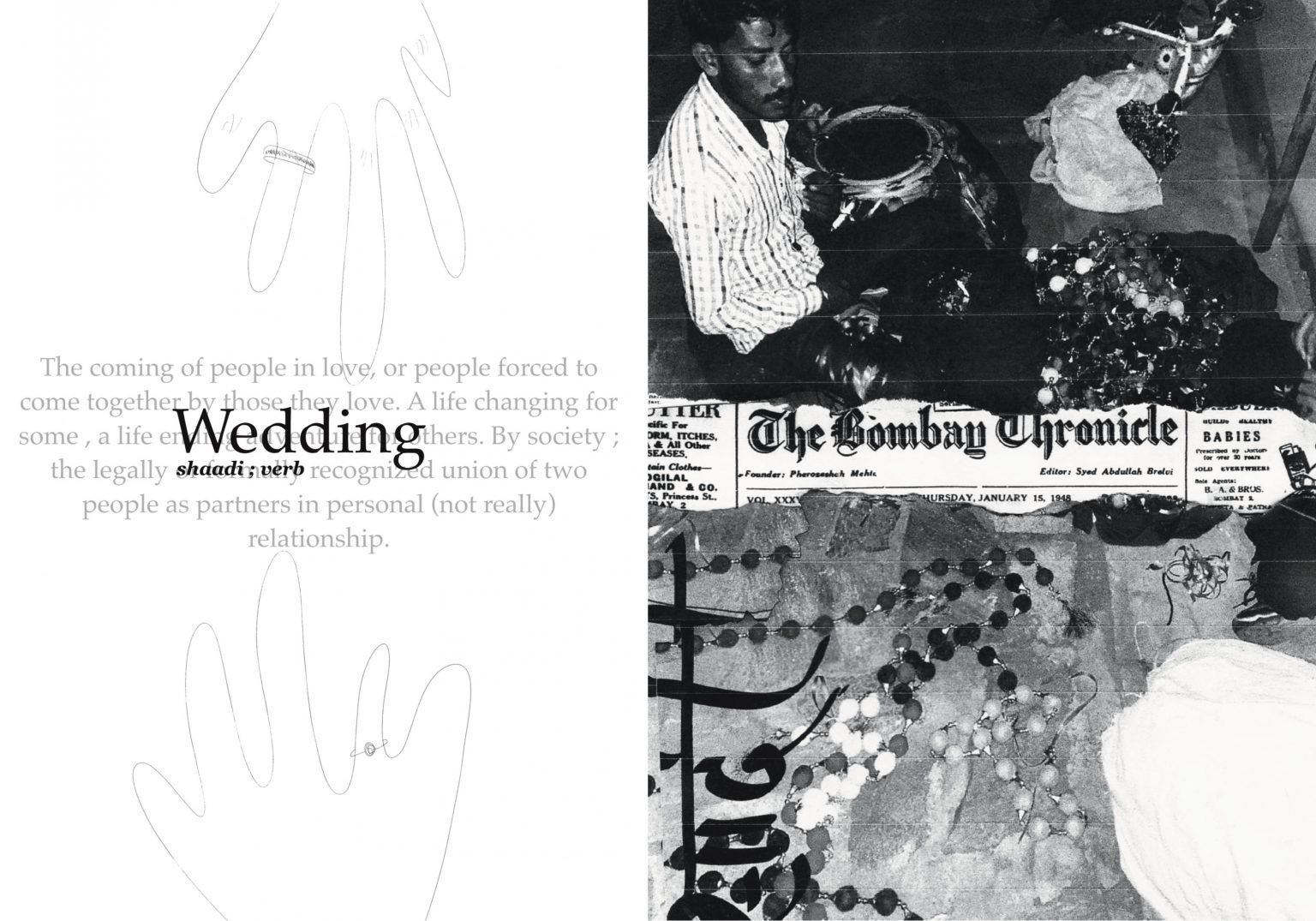
Wedding – page 2 – this peace shows the modern they were in traditions with a 1947 news Bombay newspaper in the background. Again with the text, it is and all traditional text but the meaning of the word is something completely modern, and even the hand-drawn fixtures at the back breakthrough the entire composition of the artwork.
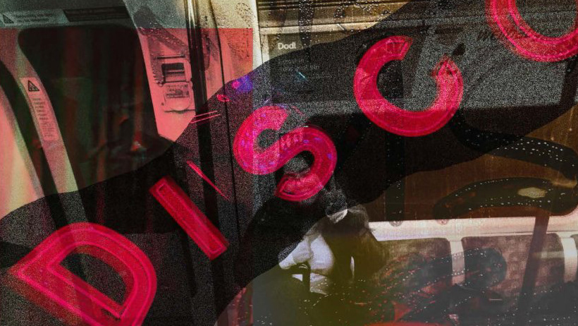
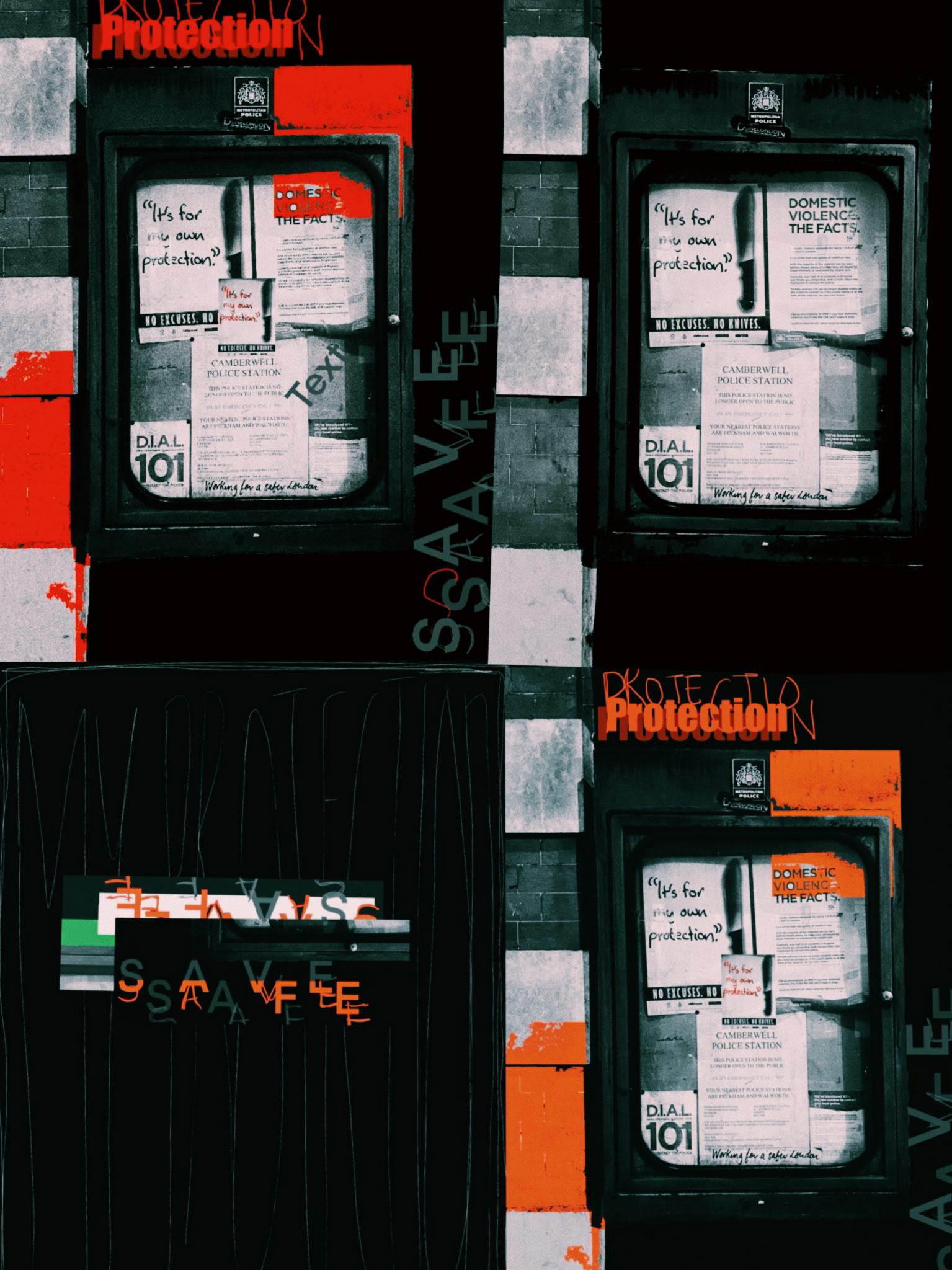
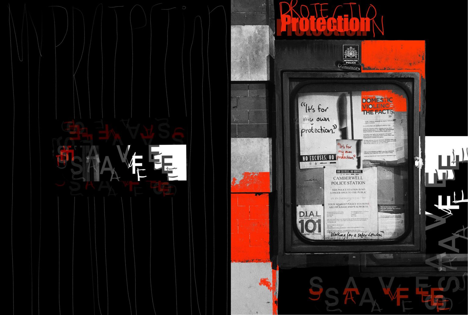
Protection – page 3 – this one is just a modern-day graphical layout with manipulation and repetition of typography and using the same color palette with a lot of red to emphasize the word protection.
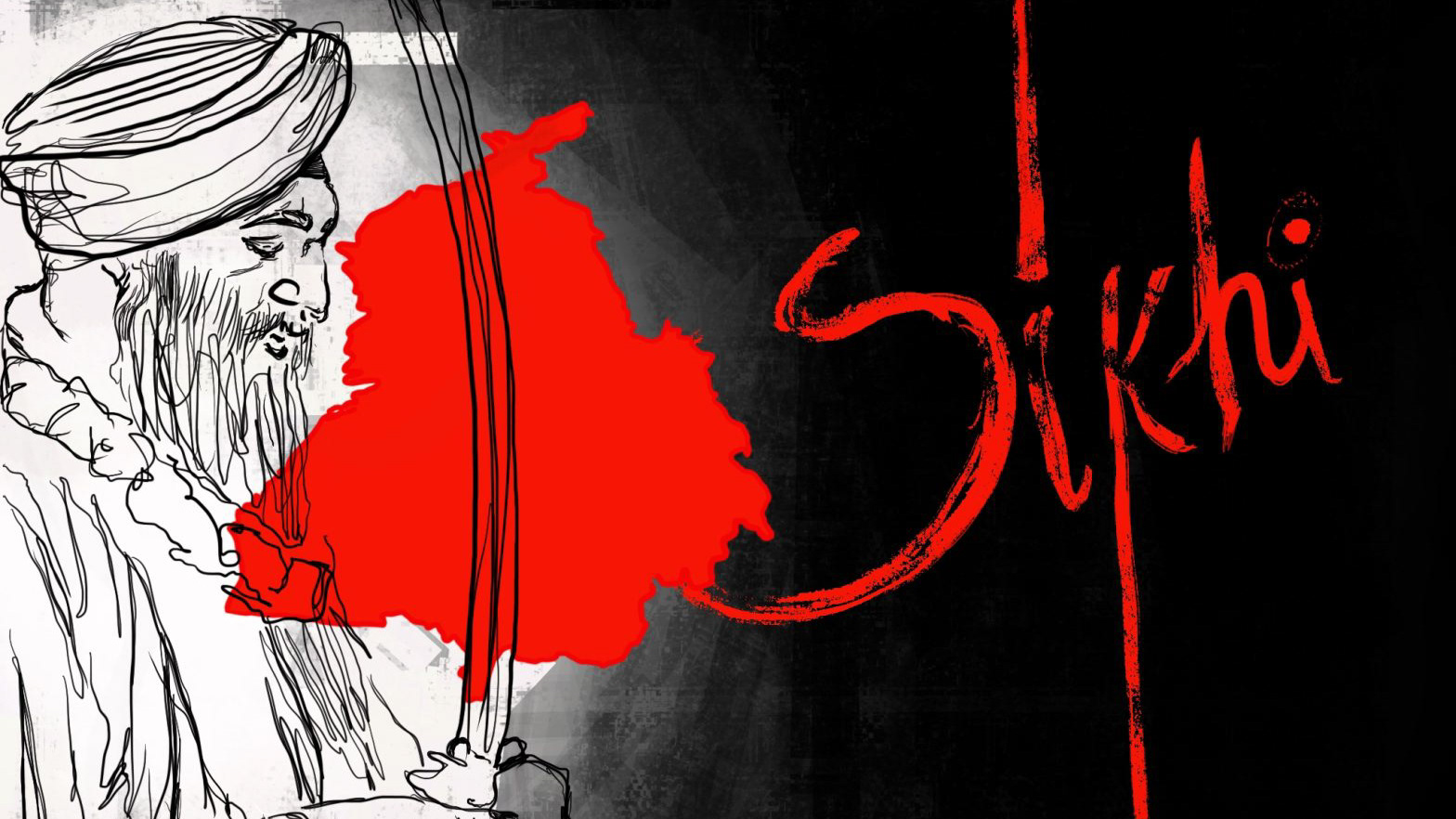
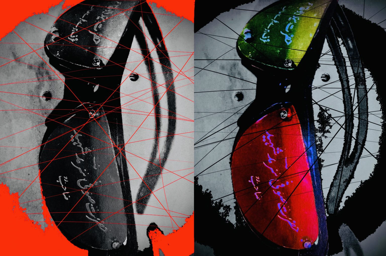
Sights – page 5 – this is the same image being shown in a black and white format and colorful format. The red and black strings show how culture and religion can be changed, deferred, and completely rationalized, They show the misunderstanding of wrong connections and the wrong views we make through our eyes just because of our beliefs or believes that we have been forced to believe
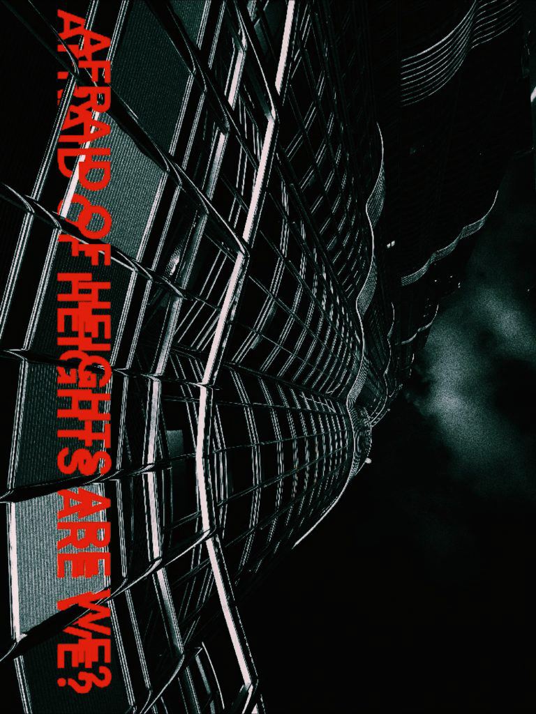
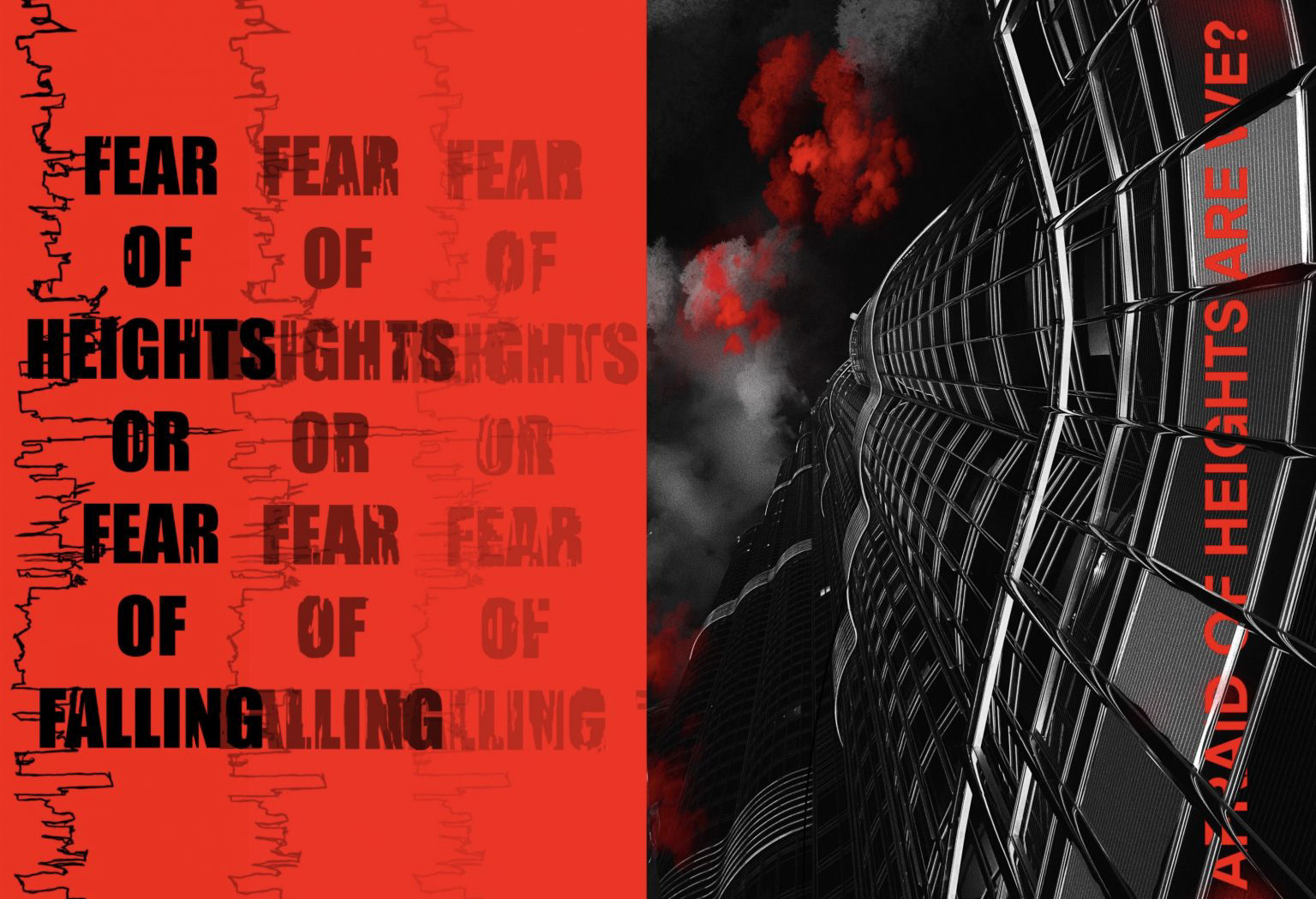
Heights – page 6 – this one comes with the traditional and the very old saying which is also very intellectual – ‘fear of Heights of fear of falling ‘ no while this was very traditional alongside is a very unique and unfamiliar perspective of viewing the Burj Khalifa, so rather than looking at buildings from the top and being scared of Heights this perspective puts the question from the bottom 2 when you look up to the building, again a modern approach to a very traditional and all saying.
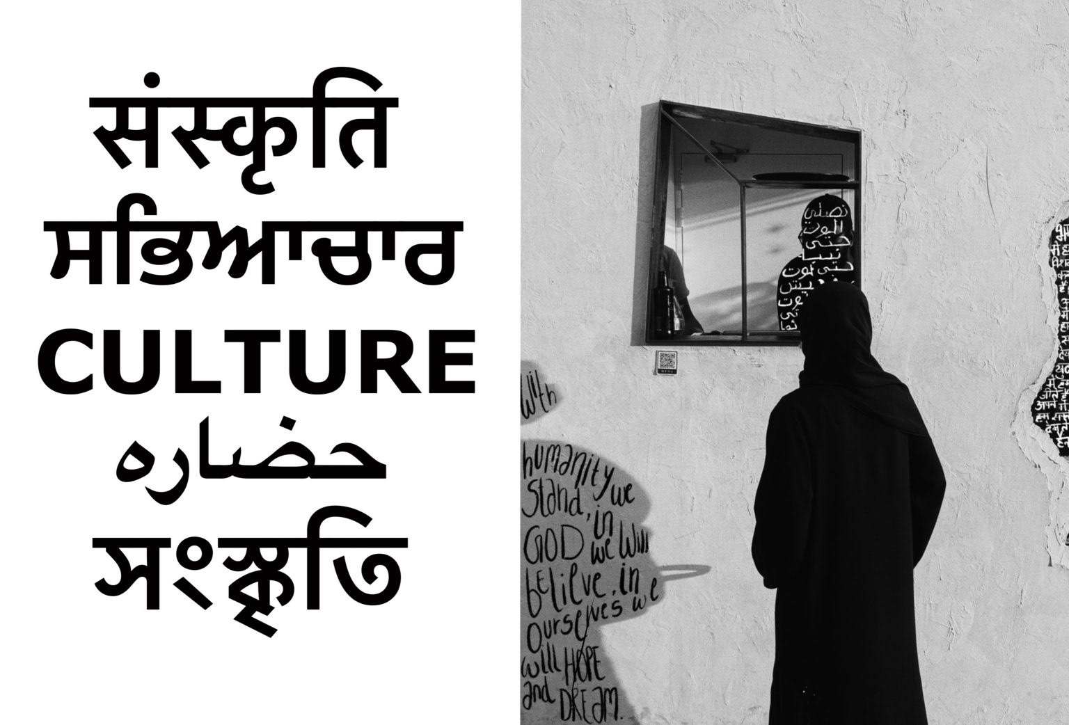
Culture – page 4 – this artwork represents unity, difference, and how about all those as people, as humans we still rise together. Along with being written in English, the word culture has been written in Sanskrit, Punjabi, Arabic, and Bengali. This artwork of mine is with special focus on India and how even though we are such a diverse country we are unified together on so many bases one of them being our culture, our religion, and backgrounds. The use of structure typography alongside hand handwritten codes on the photo is the contrast that I have achieved in this artwork
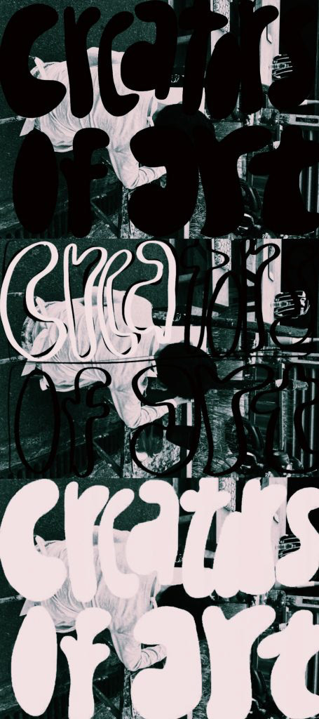
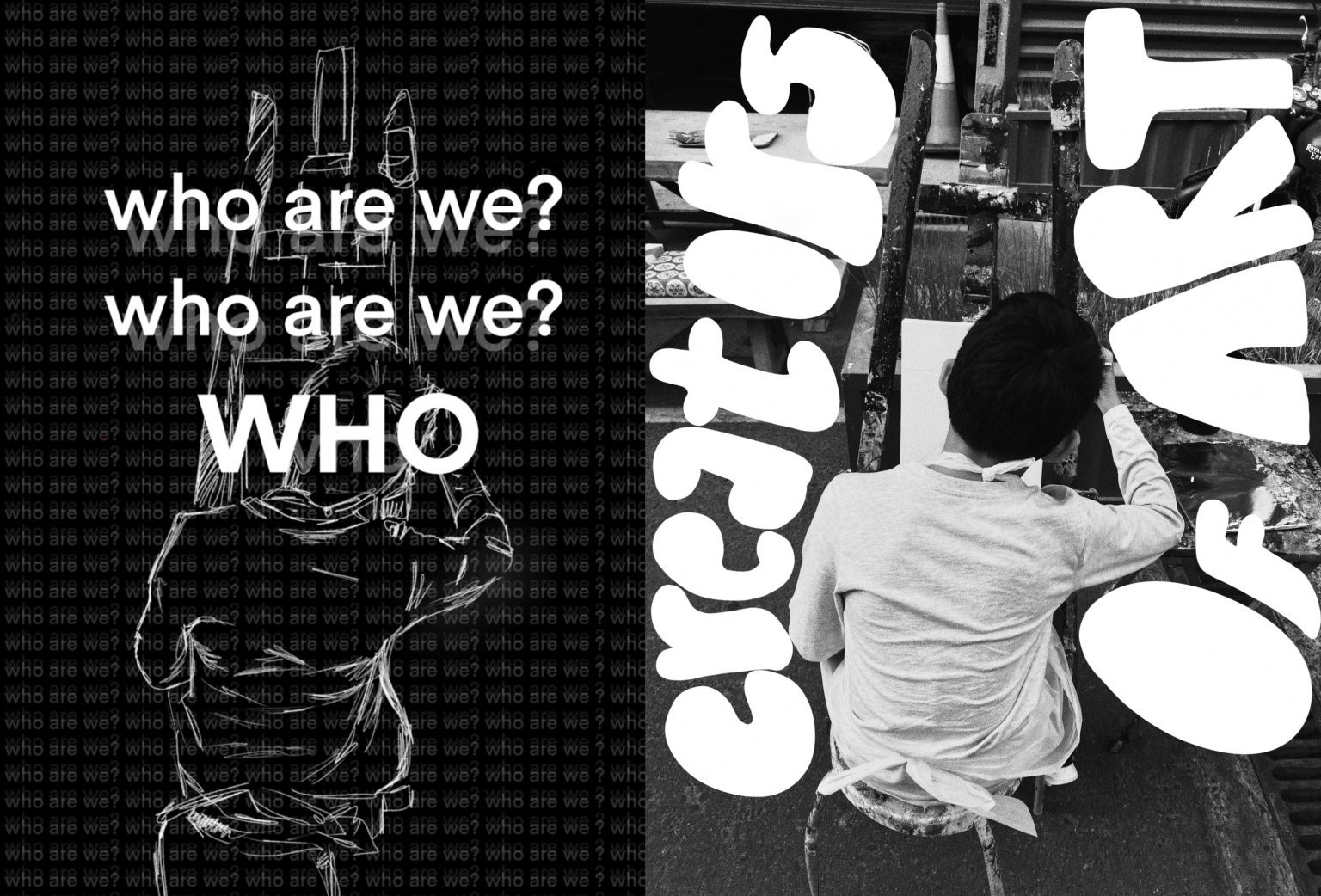
Creators of art – page 7 – this work is one of my biggest inspirations from David Carson. While I’ve been able to manipulate and use repetitive typography in this heart work alongside a very block font, on the other hand, I’ve been able to use I lose handwritten font to answer the very bored, strong an old-time question ‘who are we ‘. The child of the easel is a representation of all the future artists discovering who they are.
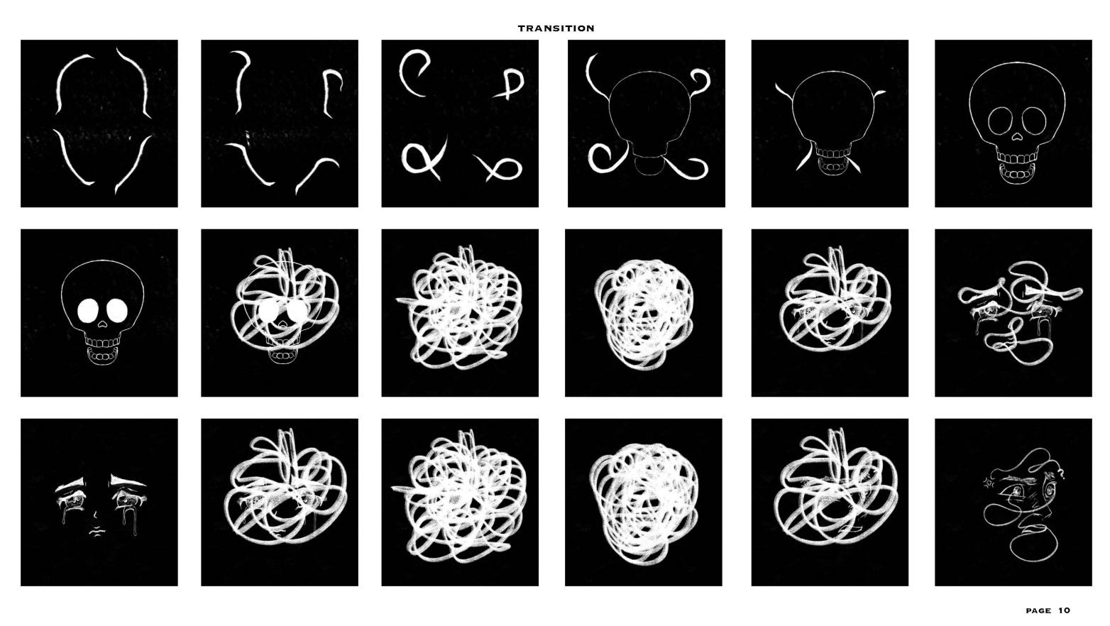
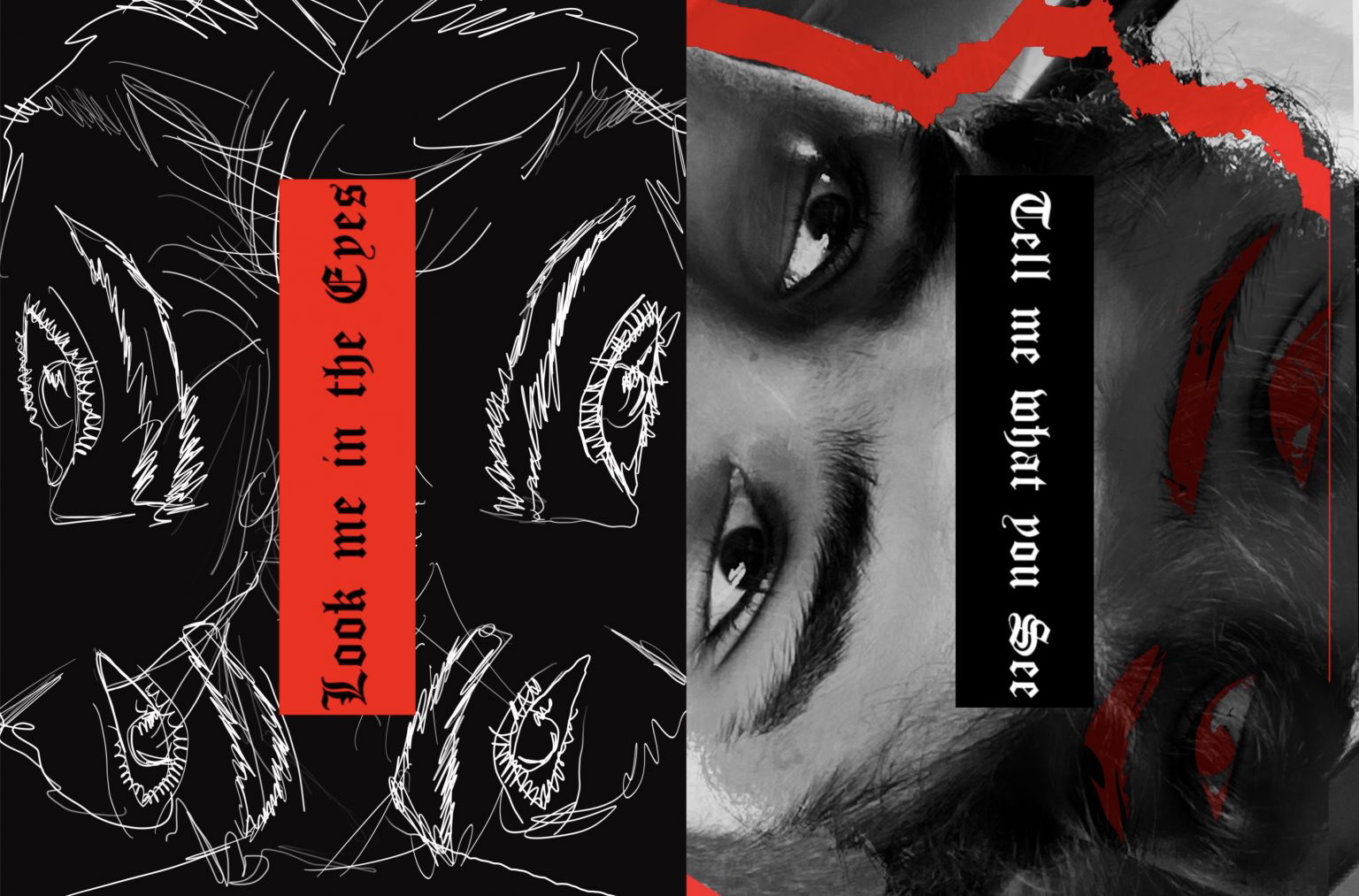
Eyes – page 8 – this is a completely modern-day edit, with the use of all Roman English font – that is the contrast. Otherwise, the bold use of red in both the images and the hand drawing along with Photoshop editing makes it a truly modern-day graphic design edit.

