collection, blog post 1 - 16.02.2021
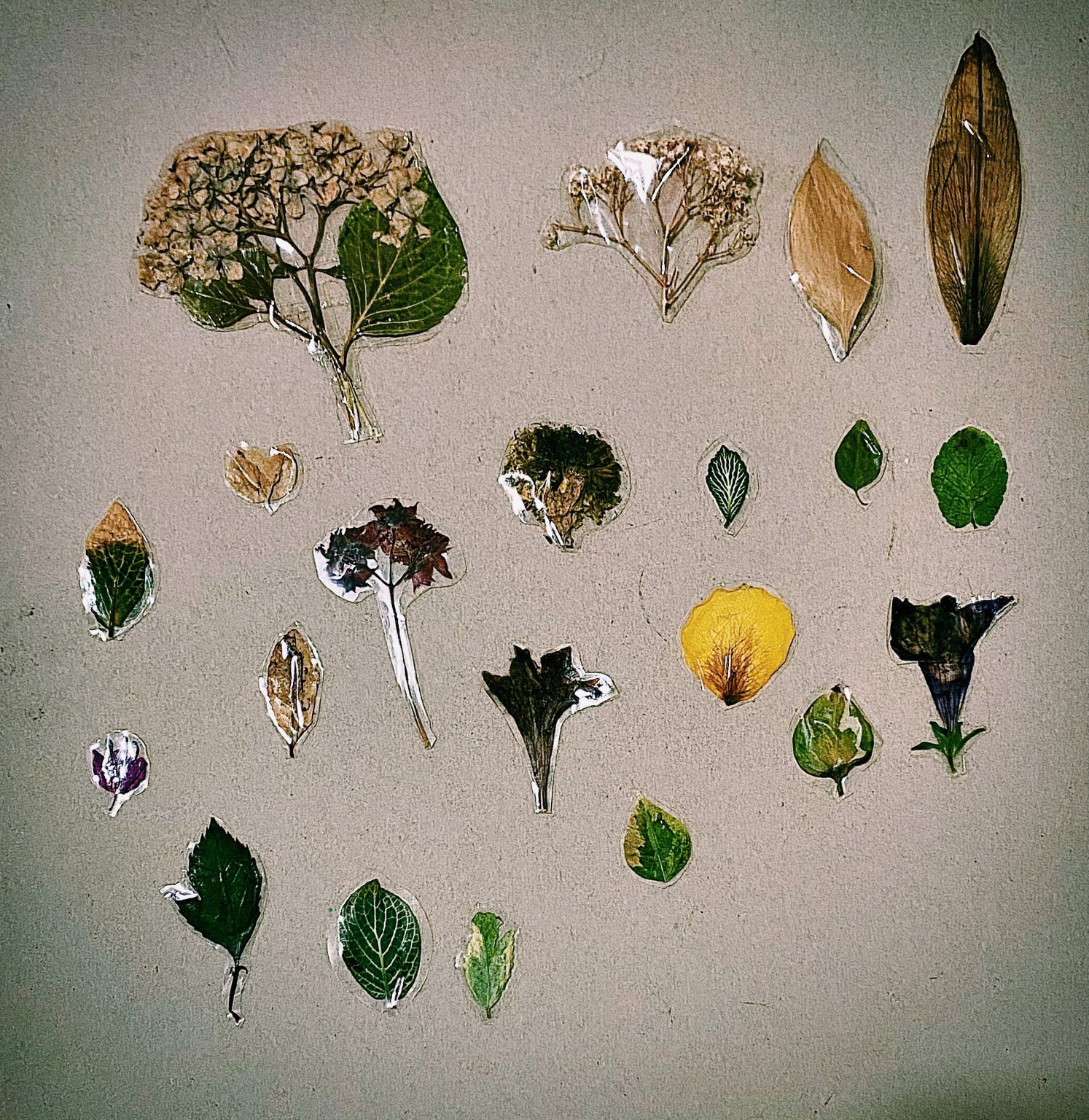
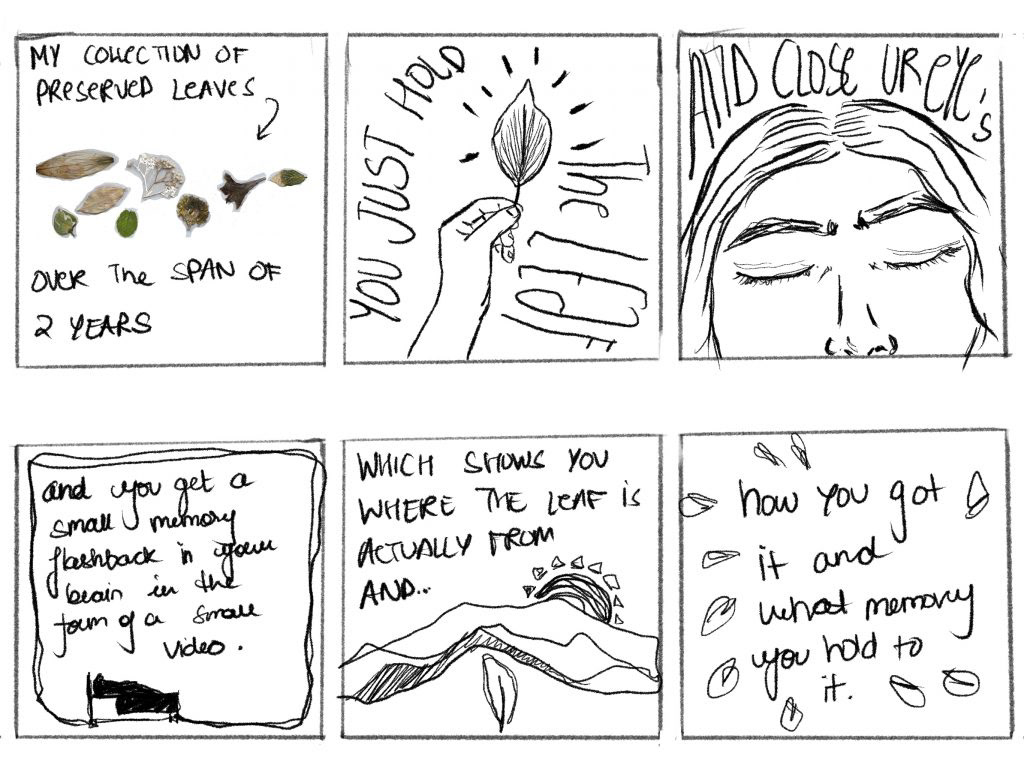
The option I have chosen is to click 3 to 5 graphic images of my collection’s data. After a lot of thought and trial and error, I finally chose what my collection will be of. My collection is 25 preserved leaves and Flowers that I've collected over the last three years from different locations all over the world (India, Dubai, Switzerland, and United Kingdom ). I've studied each object in my collection very thoroughly and seriously to see the similarities and differences among the objects in my collection and to also find the binding factor that makes all my objects together with a ‘collection ‘. I intend on showing at least four pictures that visually show the data I have collected in different aspects and communicate the facts and figures through visual language. After being really confused as to what data visualization is I tried it with my own project and got a much better understanding of it. My next step is to start collecting data under various bases and narrow down my selections two at least five topics and create graphical illustrations on them.
collection blog post 2, 24.02.2021
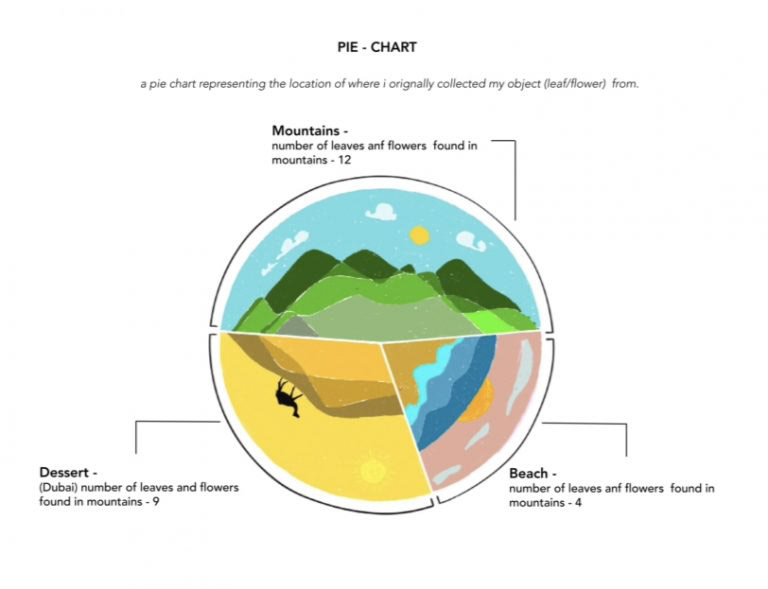
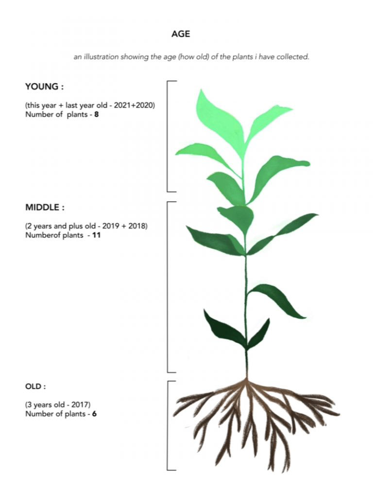
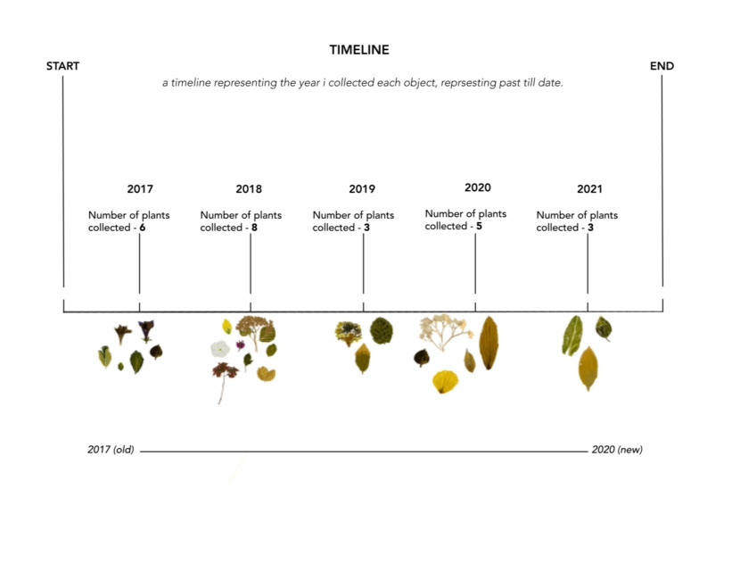
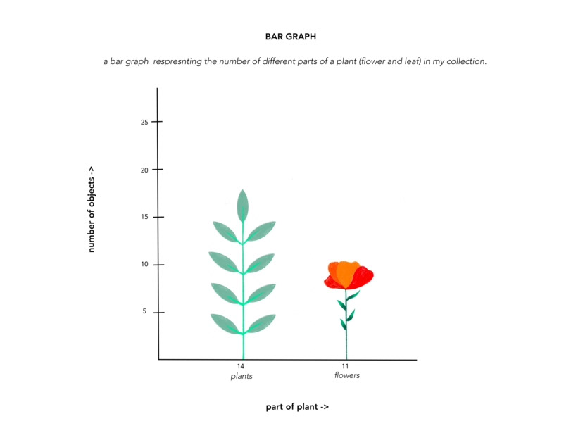
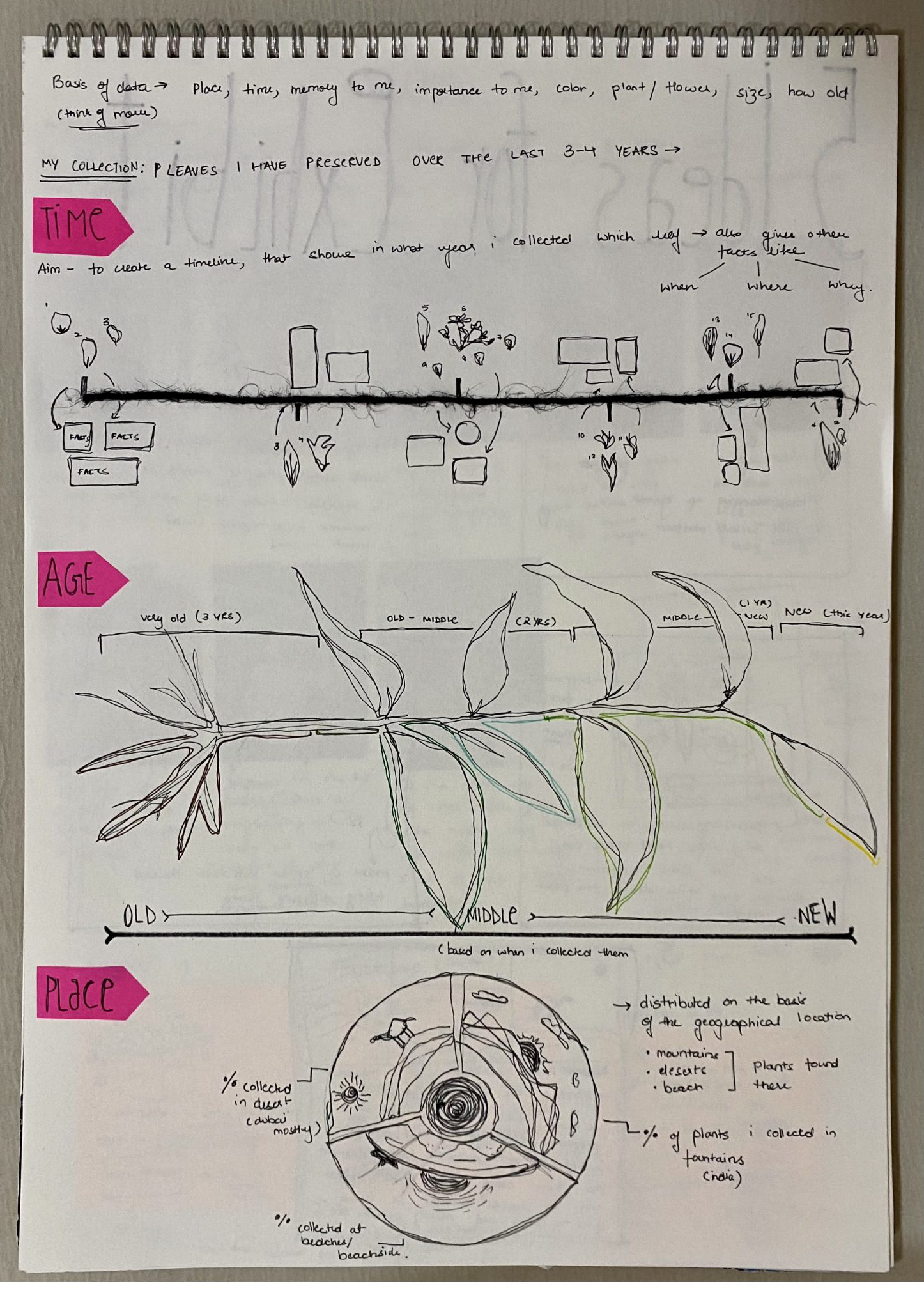
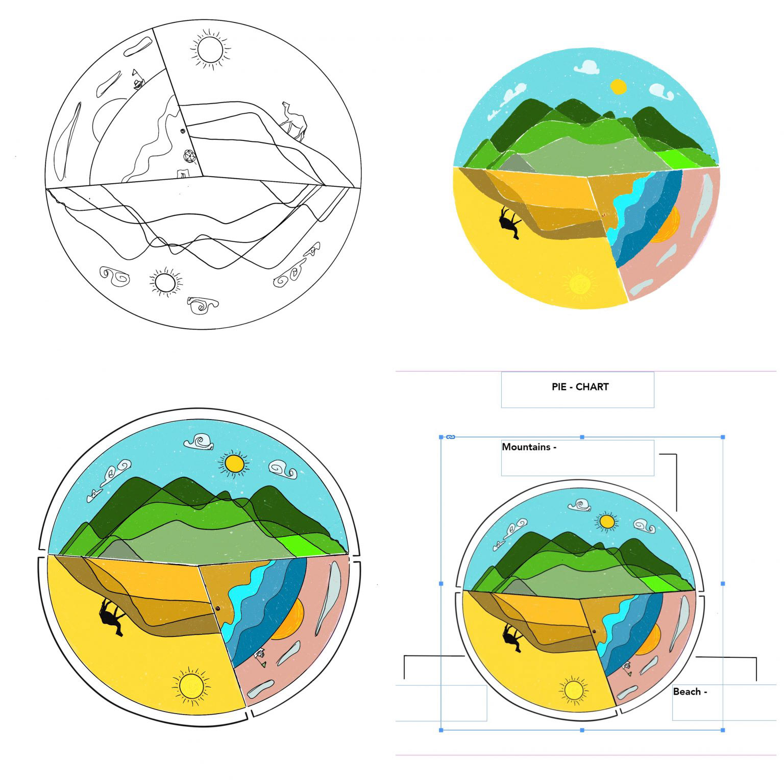
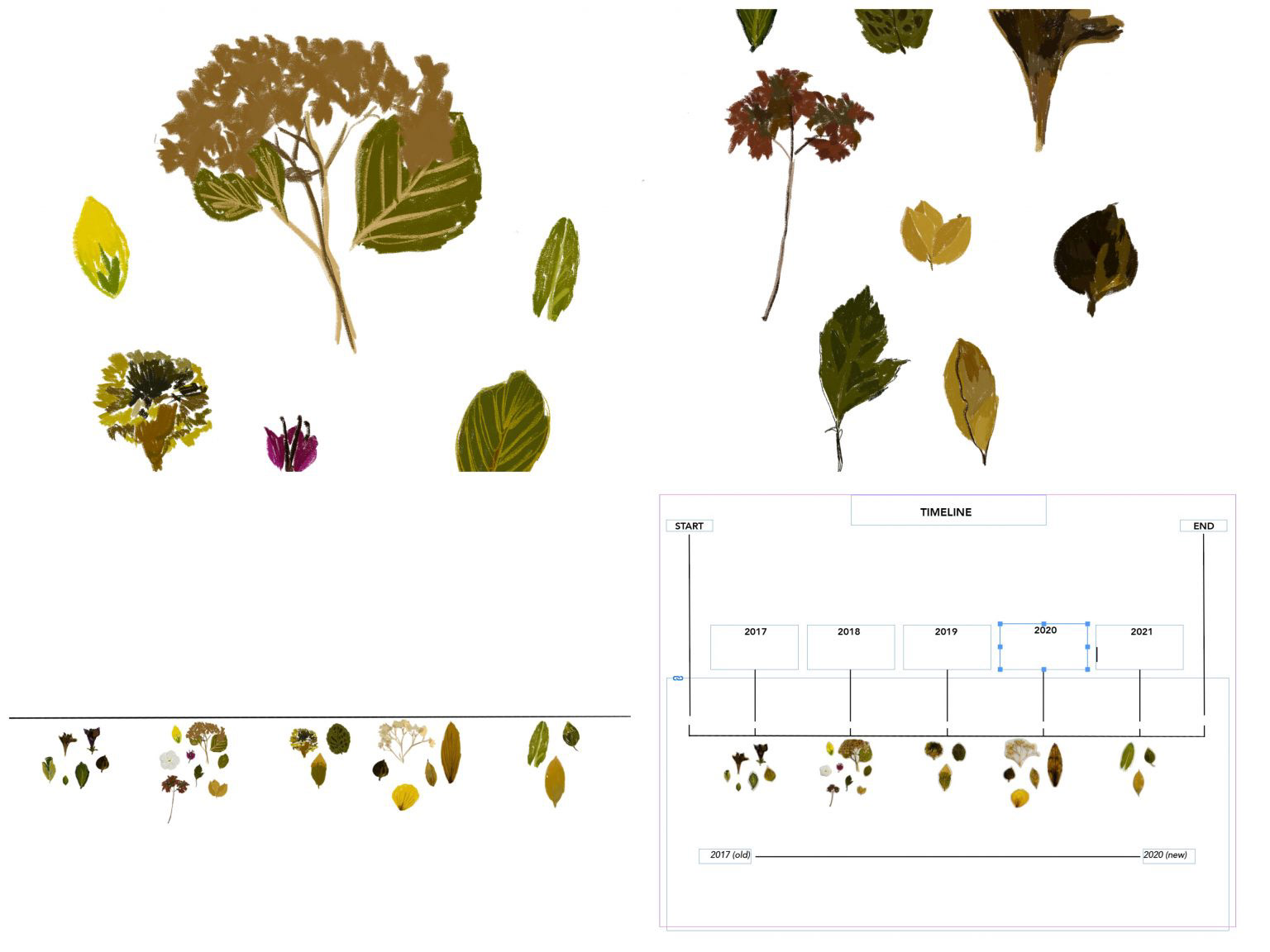
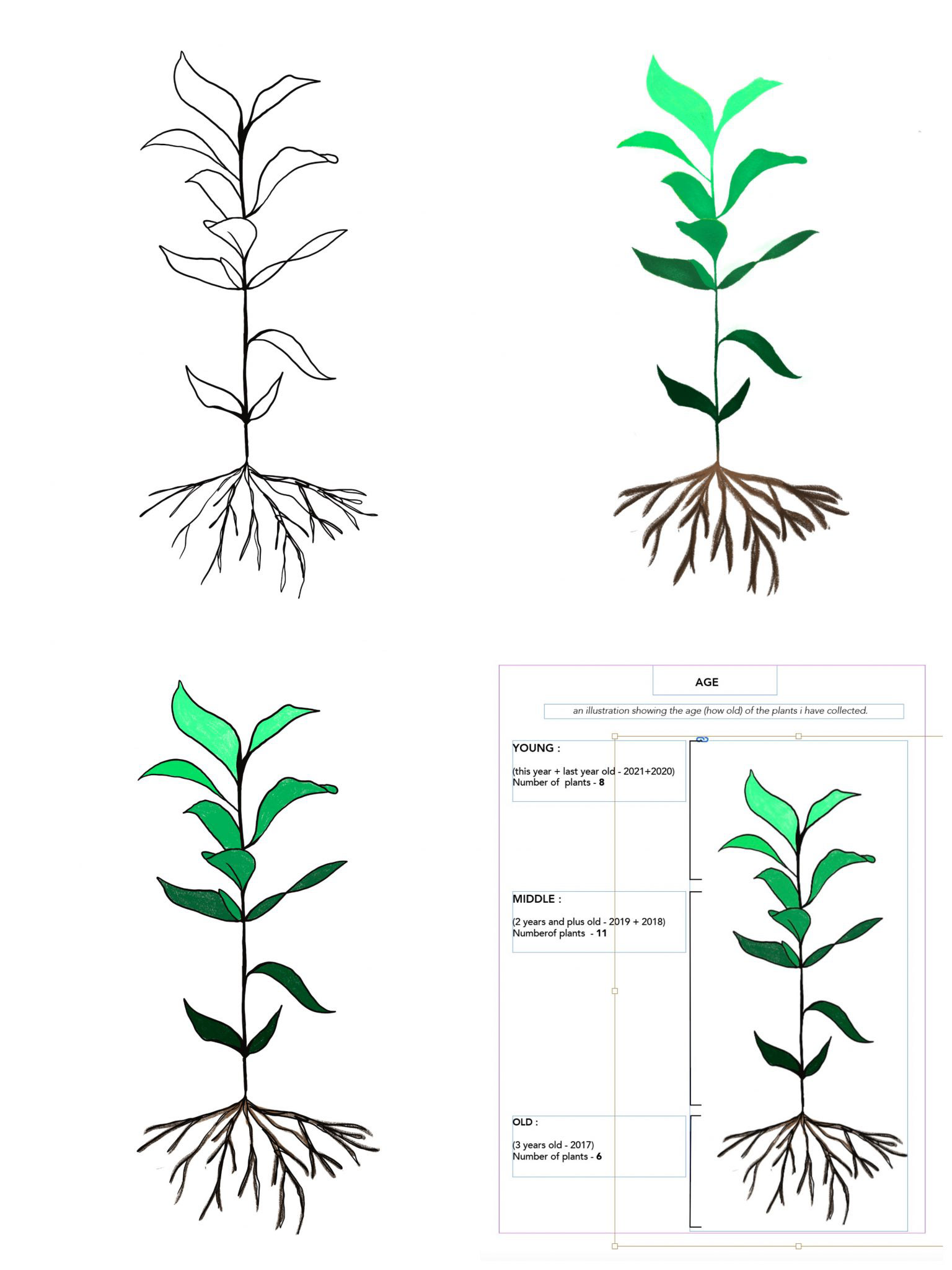
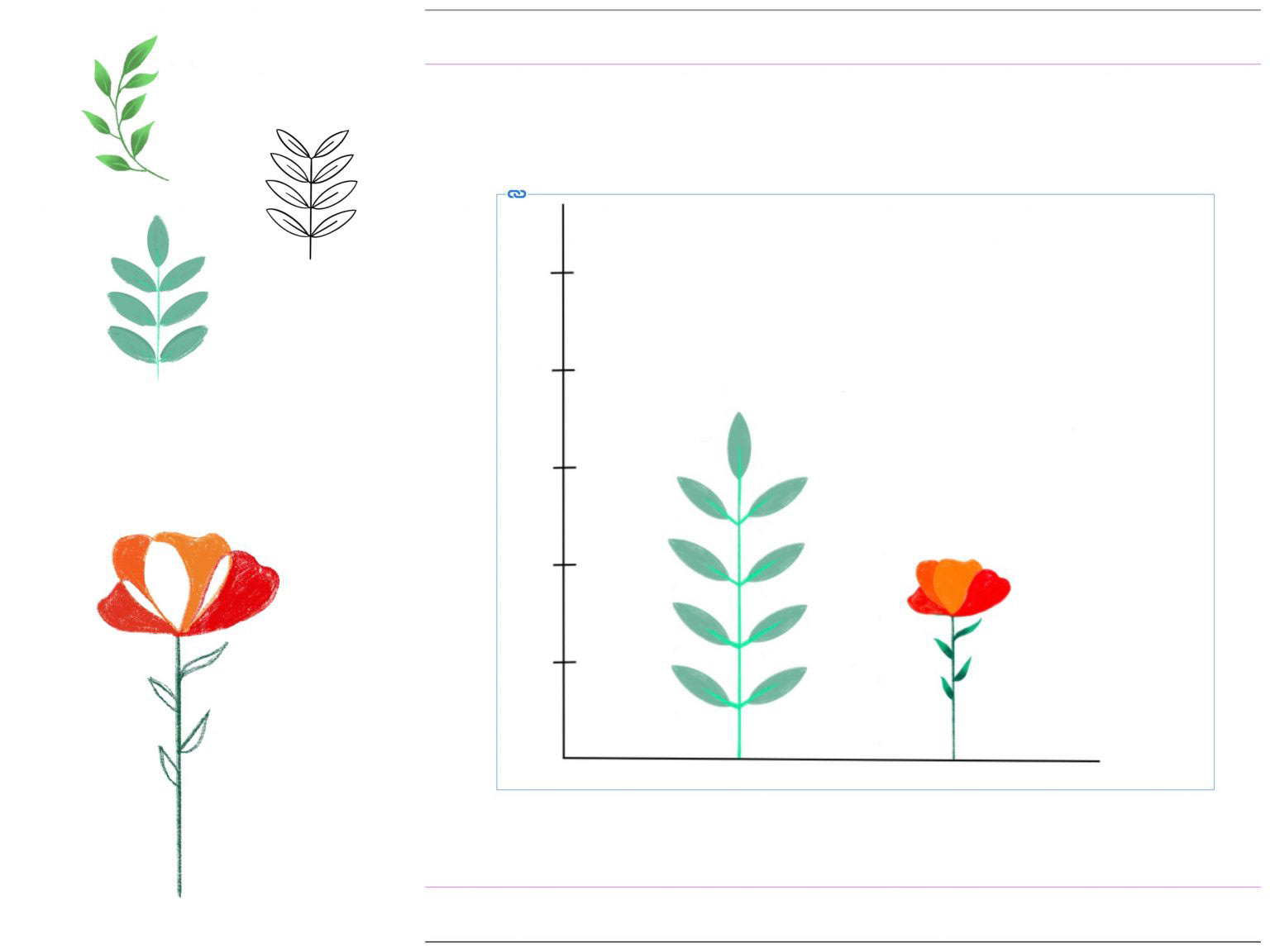
For my project, I’ll be making graphic images with data visualization of my collection. The basis of data collected will be -the time it was collected (year), how old is it now, the location of where it was collected, and what part of the plant does the object belongs to. The first option will be done in the form of a timeline, the second with an animated image of a plant, the third in the form of a pictograph and the 4th will be done with a detailed analysis of a plant and a bar graph to support the data. I’ll start making the graphic images from tomorrow itself so that I am done with it by the first week of March and have enough time to edit and make any changes required till the deadline. The images will be very plain and sophisticated and will provide clear communication of data to the viewer. the images will be in the color combination of plants (different shades of greens and browns ) and will only show emphasis on the data I’ve collected and the visual communication that will be in the picture.
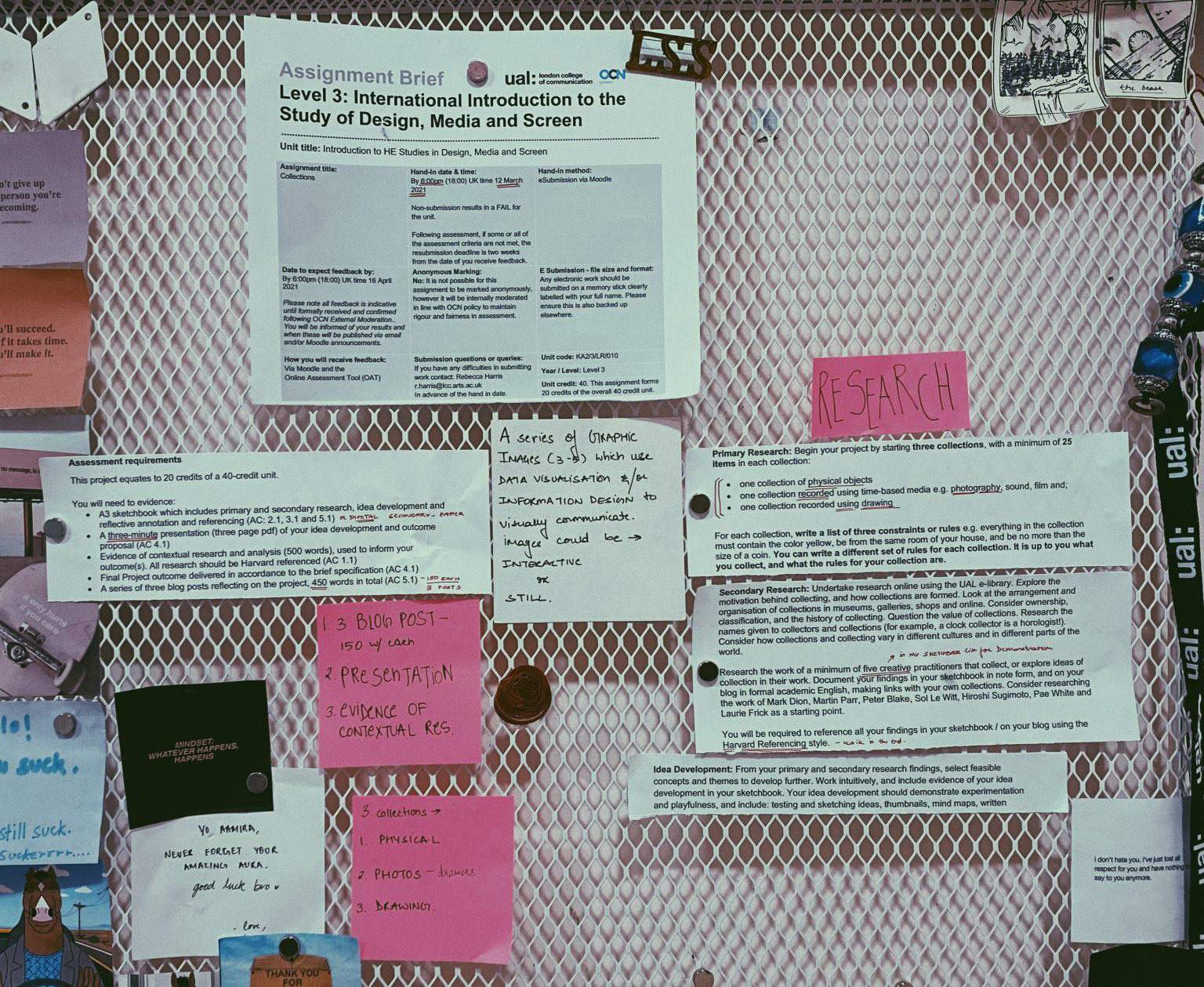
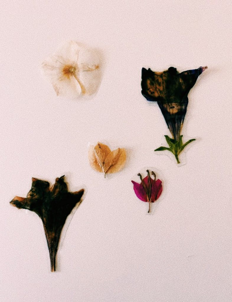
3 Collections
1. Physical Collection
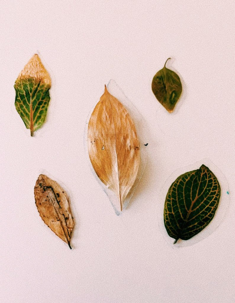
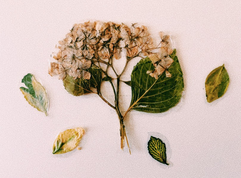
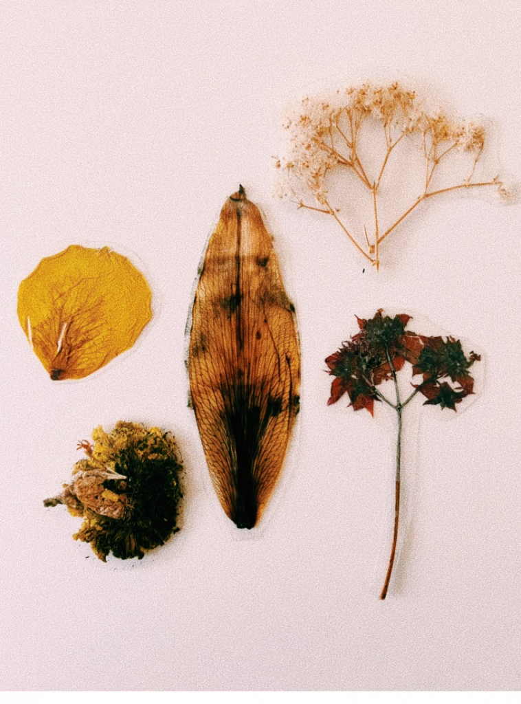
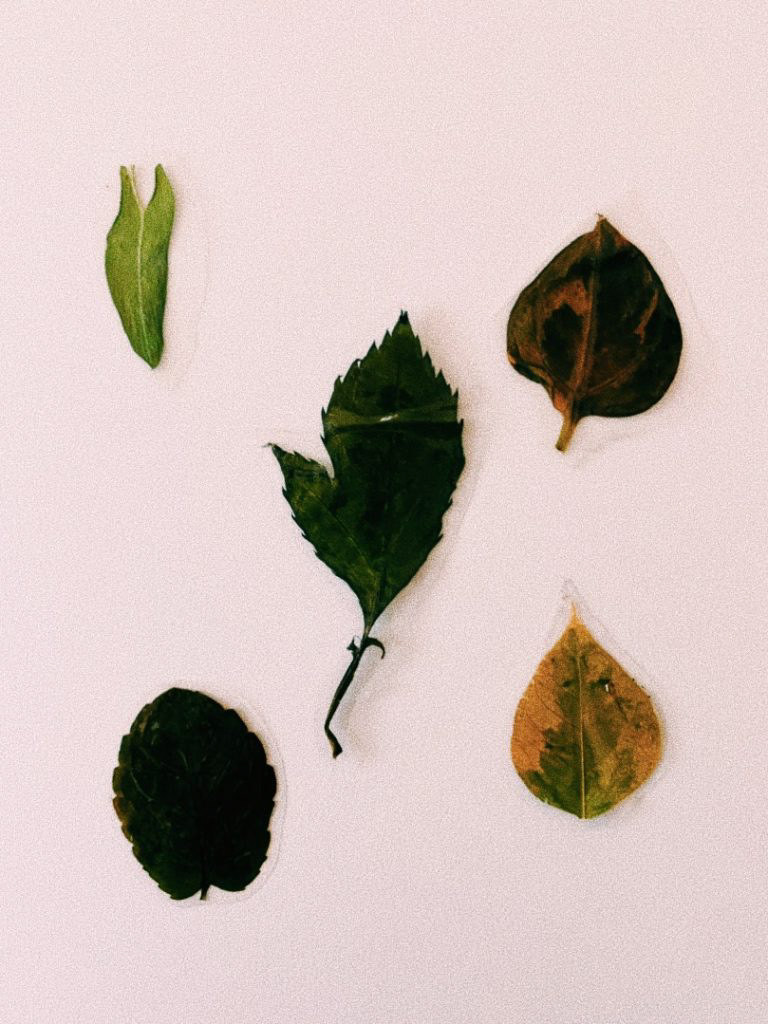
2. Photos (common aspect – the color green)
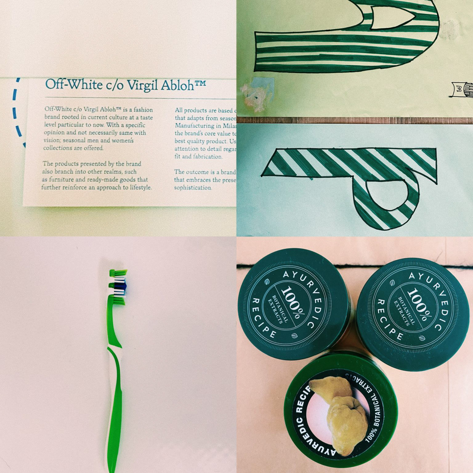
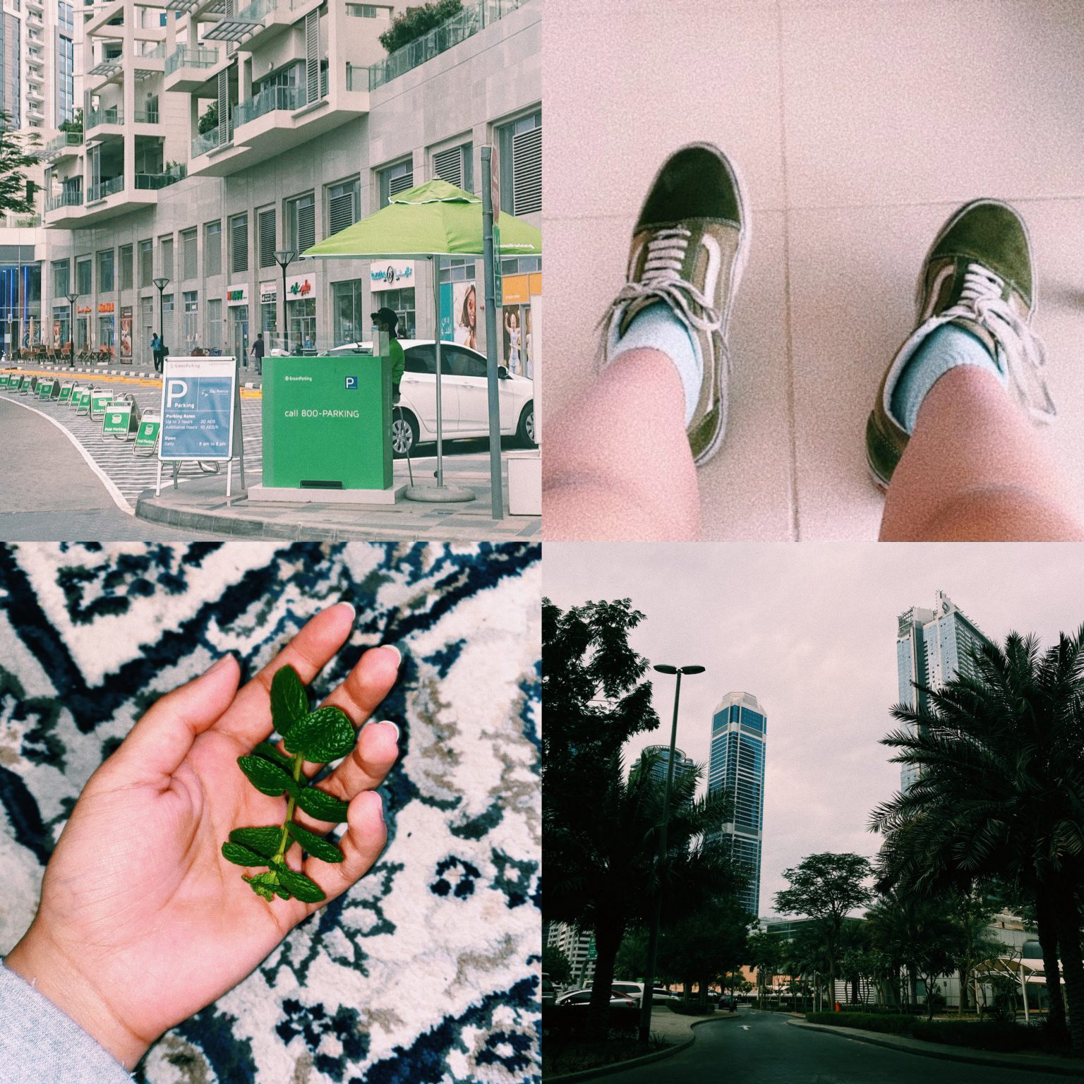
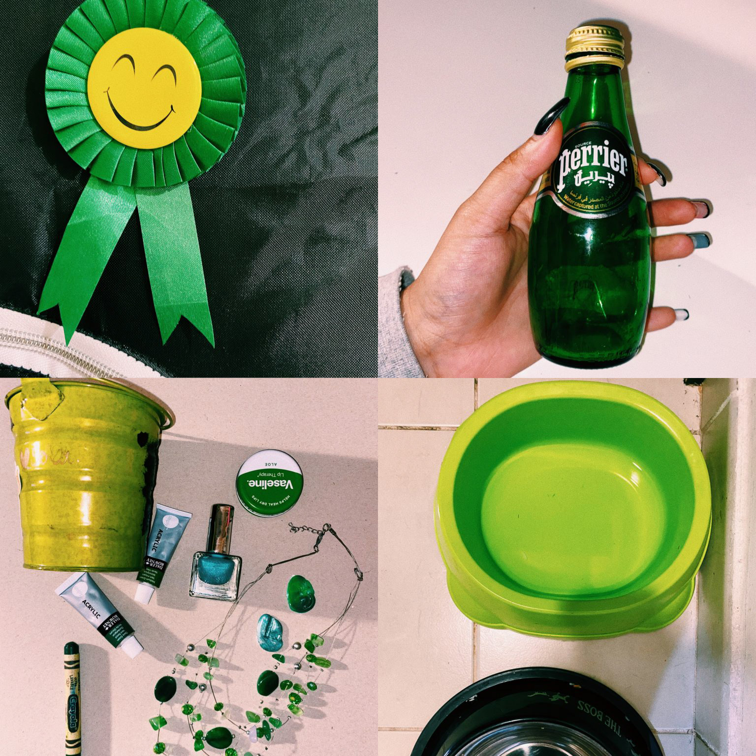
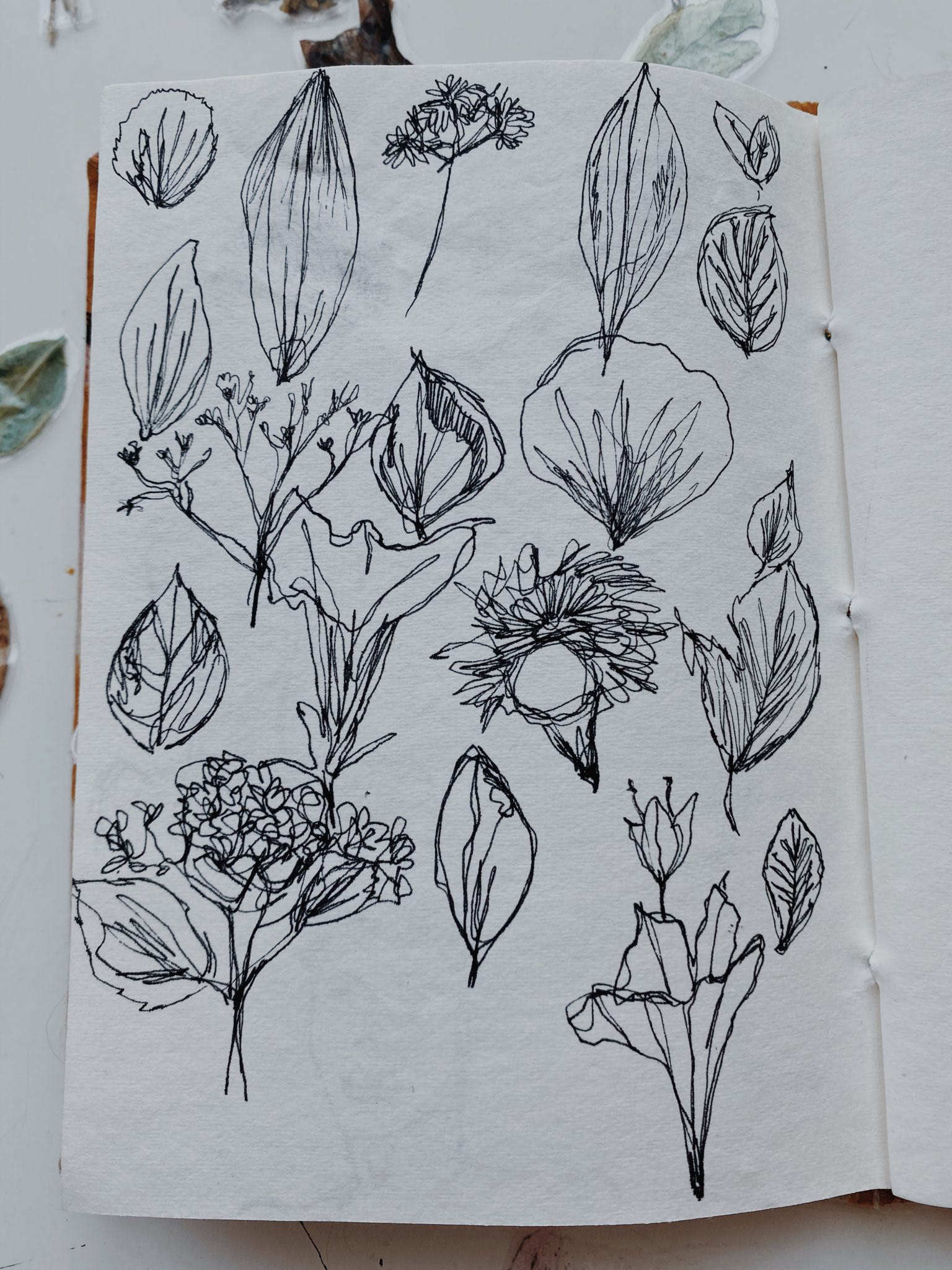
3. Drawing – line drawing of my original collection (25 leaves or flowers)
collection blog post 3, 12.03.2020
My final outcome consists of 4 graphical images. The 4 images are based on the data that I have collected from my collection which is the basis of -location, year of collection, age since collection, and what part of the plant it belongs to. All the illustration in my graphic images is hand-drawn and follows the same pattern and design of drawing which is chalk effect with illustration drawing and no boundaries or outlines on the sketch. I've used a simple line drawing as the basis of my sketch and have developed the drawing on that further. My graphic images clearly communicate the data through visual representation as well. I made my images as simple and clear I good so that they would be clearly communicated to the audience without any doubt or misunderstanding. I've certainly learned a lot about graphic images after this project and came across a new concept of data visualization and visual representation, and my understanding and learning can be seen through the growth and development of my project.
